SUBMIT WEDDING
View All Weddings in The Southwest
This Chic Austin Wedding Took Place in a Glass Barn! The Ultimate Statement Venue.

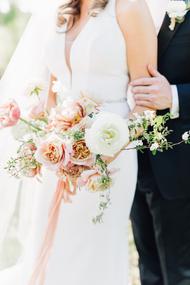
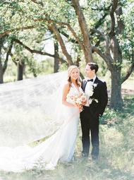
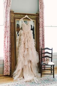
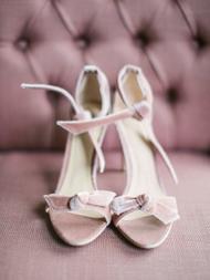
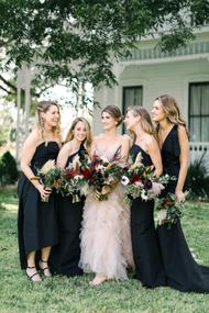
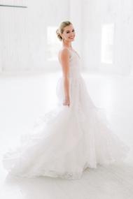
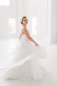
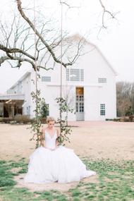
If you’re looking to take your dream barn wedding next level, you must see this GLASS barn at Barr Mansion in Austin! This is rustic elegance at it’s finest, my friends. With guidance and planning by 36th Street Events, Aly & David celebrated in the chicest way possible for their summer fete—complete with a to-die-for blush Monique Lhuillier dress. I’m crushing hard on this one and I have a feeling you will too, once you peek at these captures by The Edges. What are you waiting for?!

From The Edges… Aly & David met at a dive bar in NYC several years ago and the rest is history! They had destination wedding in Aly’s hometown of Austin, TX. The wedding venue is an estate that includes a home built in 1898, a working farm, and a restored 18th century barn transported from New York. The design was a perfect blend of NYC chic and fun, quirky Austin with a moody and romantic aesthetic.

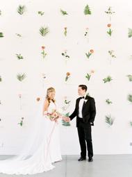
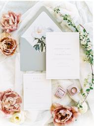
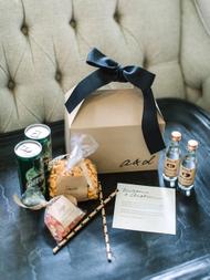
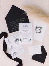
There were so many unique and personal design elements included throughout the day. The invitation and paper goods were created by one of their closest friends, Robert Alvarez. Guests were welcomed to the weekend with a box of treats like Tito’s Vodka (from Austin) and the couple’s favorites snacks of Goldfish crackers and champagne gummy bears. The ceremony backdrop was a custom pampas grass installation that perfectly complimented Aly’s dress.

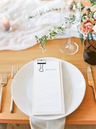
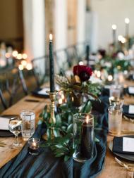
Cocktail hour included live music and the cutest “beer burros” for entertainment. Instead of signature cocktails, they offered whiskey and bubbles stations so guests could sample different varieties of each. Dinner was served in a glass barn with rustic wood tables and lots of gold and black accents. The rest of the evening was spent dancing (to a live band, it’s Austin of course) and lounging in the warm Texas night.

Photography: The Edges Wedding Photography | Videography: Moonlit Weddings | Floral Design: Posey Floral and Event Design | Wedding Dress: Monique Lhuillier | Bride's Shoes: Alexandre Birman | Bridesmaids' Dresses: Alexia Maria | Catering: Barr Mansion | Beer Burros: Texas Hill Country Events | Ceremony & Reception Venue: Barr Mansion | Groom's Shoes: Del Toro | Groom's Tux & Bowtie: Bonobos | Planning: 36th Street Events | Rentals: Loot Vintage Rentals | Rentals: Whim Hospitality | Stationary & Calligraphy: Robert Alvarez

These Vendors are members of our Little Black Book.
For membership information, click here
These Featured Designers are members of our Look Book.
For membership information, click here
Muted Color Schemes Are About to Be Summer 2019’s Hottest Wedding Trend

What happens when you take an epic list of vendors and put them together for a day, styled and planned by Westcott Weddings? You get this elegant and romantic workshop held by The Editorial Series and Jenna McElroy! Focusing on the space, The Contemporary Austin – Laguna Gloria, Westcott Weddings produced the ultimate photography workshop with every detail imagined from floral installations by Clementine Botanical Art to flawless attire by Serendipity Bridal and The Black Tux. Take a peek below and see how a great team can create a day of old-world elegance mixed with modern design for the picture perfect workshop!

From Westcott WeddingsThe Editorial Series is a one-day photography workshop for film and digital photographers. For the first in the series, Jenna McElroy chose the always-beautiful grounds at Laguna Gloria as the backdrop. Photographers gathered in the late afternoon, and Jenna walked them through each of the styled vignettes before giving each the opportunity to capture the spaces through their own lenses. The museum grounds at Laguna Gloria are immaculately curated and lend themselves well to the romantic, European-inspired editorial that Jenna envisioned.

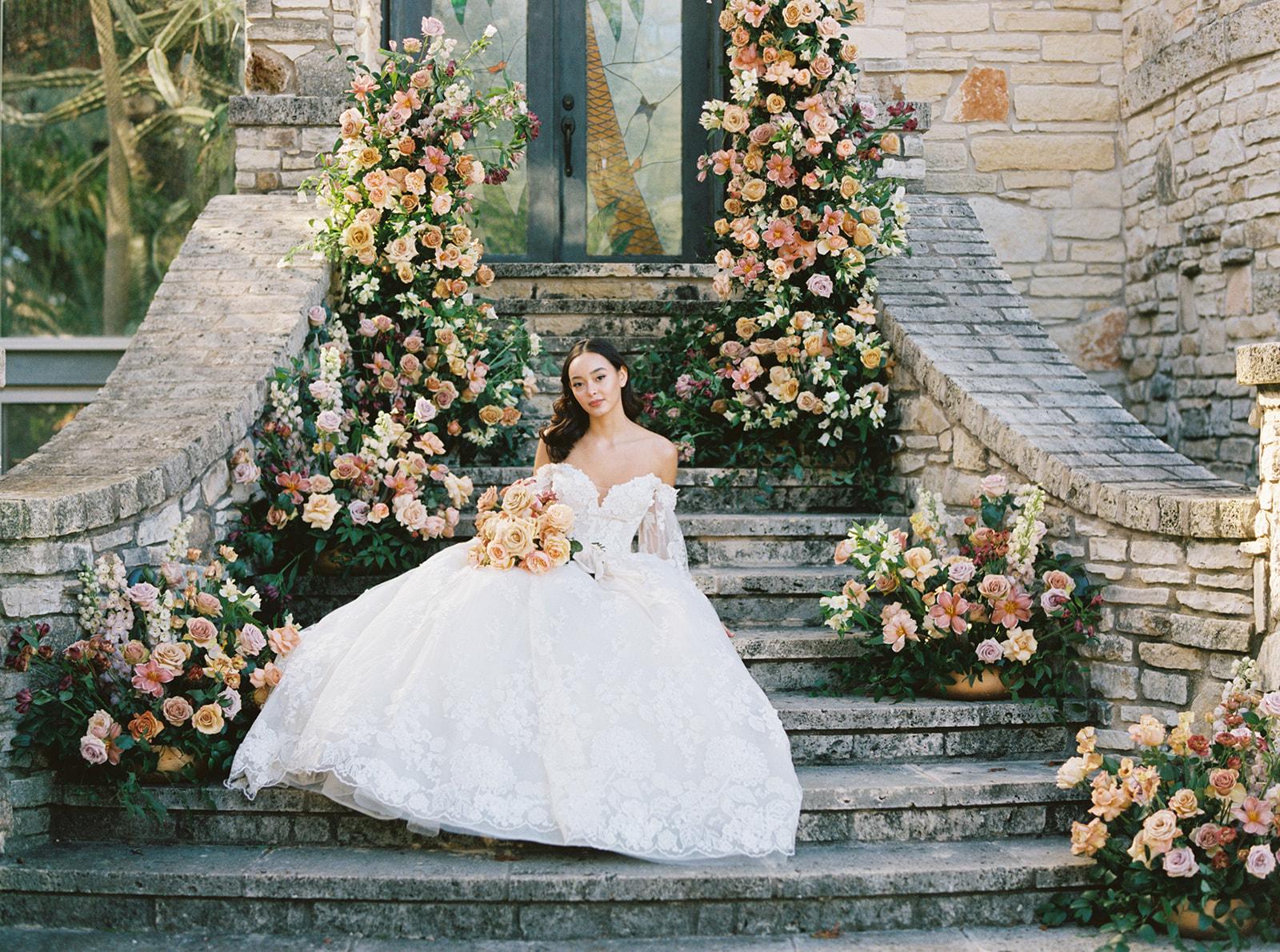
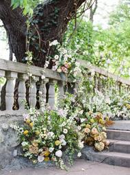
We decided on a color palette of warm, muted summer tones and worked to balance the old world elegance of the grounds with more modern touches. Christin with Clementine Botanical Art designed a wispy, romantic floral installation on the stone steps (often overlooked at real weddings and such a gorgeous spot!), and I love the way our bride and groom were able to nestle right into it for photographs.

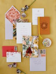
Nicolette with Isidore & Augustine designed all of the paper products, and upon seeing them, we were instantly in love with the way the soft floral drawings played against the layers of color and more modern typeface she selected. She was able to beautifully capture the whole essence of the shoot in that gorgeous invitation suite.

Michelle Boyd painted a custom canvas for the workshop, which was used as a backdrop for styling the suite and added romantic texture (which no one does better than her!) to the shot. We kept the table design fairly simple, using Loot’s pieces and La Tavola linens to create a luxe, refined table that felt right at home on the museum grounds. Florals, paper goods, and (delicious!) appetizers and desserts (thanks to Jessica Scott and Candace from Simply Delicious Custom Cakes, respectively) added touches of color and life to the vignette. Candace also created a stunning three-tier cake. Christin complemented the pink architectural details Candace designed with fluffy blooms to achieve that same modern, romantic aesthetic.

We worked with Brigitte at Serendipity Bridal to select an intricate lace dress for our bride from Chic Nostalgia and The Black Tux to outfit our groom. Makenzi Laine styled each of them to perfection, and accessories from L. Priori Jewelry and Bella Belle Shoes completed the look. We’re so thankful for the team that came together to bring this vision to life, and we’re looking forward to the next in the series.

Photographer: Jenna McElroy | Floral Design: Clementine Botanical Art | Wedding Dress: Serendipity Bridal | Bride's Shoes: Bella Belle | Jewelry: L Priori Jewelry | Food: Jessica Scott Photography | Hair and Makeup: Makenzi Laine | Groom's Attire: The Black Tux | Behind the Scenes Video: Sight and Sound Films | Cake and Desserts: Candace Powell | Editorial Series Sponsor: PhotoVision Prints | Editorial Series Sponsor: Dekora Album | Event Design, Planning and Styling: Westcott Weddings | Linens: BBJ La Tavola | Model Agency: Helena Sandahl | Paper: Isidore Augustine | Rentals: Loot Rentals | Styling Backdrops / Custom Art: Michelle Boyd Studio | The Contemporary Austin - Laguna Gloria: The Contemporary Austin | Wedding Dress Designer: Chic Nostalgia | Workshop : Jenna McElroy | Workshop Host: Jenna McElroy

When Their Last Name Is Flowers, You Better Believe They Were Gorgeous!

When your last name happens to be Flowers, a garden-style wedding loaded with blooms only seems fitting, right? Lauren & Stephen’s celebration was a nod to their namesake, bursting with petals and a subtle rustic-romantic vibe at Hickory Street Annex in Dallas. They called on Ivory and Vine Event Co and Venus and Co Flowers to surround their day in beauty and it’s all for the inspirational taking, thanks to Stephanie Brazzle‘s captures below.

From Ivory and Vine Event CoThe planning process with Lauren & Stephen was all that it should be – fun, seamless, and focused on the love that these two share with one another. Any decision we made came back to the careful consideration of whether or not it was an accurate representation of the couple’s personality and style, which culminated into a carefully curated wedding day, full of personal touches and gorgeous details at every turn. We started with the idea of juxtaposing the industrial aesthetic of their ceremony & reception venue, Hickory Street Annex, with the couple’s new, shared last name “Flowers.” This created a gorgeous garden atmosphere for Lauren & Stephen’s guests, as they enjoyed the comforts of an intimate setting as rain lightly ran down the window panes that Saturday.

We selected a color palette of lavender, blush, and hints of deeper colors to give the wedding depth and excitement. Our florist, Venus & Co., selected wild spring blooms to bring a French garden aesthetic into our design. The ceremony was set to evoke an intimate feeling, with guests arranged in a semi-circle, looking on at Lauren & Stephen surrounded by tall, garden inspired arrangements, and floral centerpieces adorning the aisle.

After the ceremony, guests dined on passed appetizers and signature cocktails while we transformed the space upstairs. Lush velvet textured linens, patterned chargers, hand-torn place cards and gold rimmed glassware adorned the table, along with the soft glow of candlelight as guests dined on home-style barbeque, a favorite cuisine of the couple. The couple and their guests danced the night away under string lights, and walked through a confetti tunnel at the end of the evening, into their new life together.

PHOTOGRAPHER: Stephanie Brazzle Photography | Floral Design: Venus and Co | cake : Bird Bakery | catering : Vestals Catering | calligraphy: Scribbles And Swirls | entertainment : Le Force Entertainment | tux : The Black Tux | transportation: premier of dallas | Linen: BBJ La Tavola | Planning: Ivory & Vine Event Co. | accomadations : the statler | bridal dress : a and b bridal | hamu: Meg B | rentals : Bella Acento | rentals : Beautiful Event Rentals | wedding : Hickory Street Annex

Modern Meets Classic with Fresh Florals at the Prospect House

You had us at bright pink peonies and modern meet classic design. Trust us when we say these cheerful arrangements from Clementine Botanical Art will literally stop you in your tracks and take your breath away. The vibrant coral and pink hues against the modern, crisp white reception planned by Bird Dog Wedding couldn’t be more stunning. Take in every detail at the full gallery of images captured by Nichols Photography… this wedding is the definition of a color pop.

From the couple…We live in Washington, DC, but had previously lived in the Austin area for over 5 years. When it came time to choosing where we would get married, Austin was an obvious choice. We spent our entire relationship taking in all the great things the city had to offer – delicious tacos, boundless outdoor activities, and plenty of live music. Given our love for the laid-back city, we knew it would make the ideal location for our modern spring wedding.

Design Inspiration:

The design inspiration for our wedding was a clean and modern garden party with an emphasis on keeping the atmosphere relaxed and approachable. When we first visited Prospect House, we instantly fell in love with the venue. The light and open design set against the Texas hill country made for the perfect space for bright florals and subtle linens. Thanks to an incredible slate of vendors and meticulous planning by Bird Dog Wedding, it all came together seamlessly. With a little stroke of luck, the wedding day weather was breezy and warm, giving friends and family the opportunity to fully enjoy the modern space.

Favorite Moments:

We surprised guests with the appearance of a Mariachi Band at the end of the wedding ceremony to kick off our cocktail hour. It created a special moment with a nod to the groom’s heritage that put the guests in a festive mood before dinner.

Fun Details:

Throughout the design process, Bird Dog Wedding helped us find creative ways to bring our design inspiration into the smallest of details. For instance, the linens used for the cake table featured embroidery which tied in blue hues and contrasted against the bright florals and simple desserts. The blue palette found its way into other elements such as the bouquet bows, blue glass goblets, and romantic candlesticks on the tables. For the ceremony, Clementine Botanical Art played off of the venue’s design elements to create a flowing wall of white carnations that provided a romantic backdrop for our vows. Another fun small detail that made its way into the wedding was featuring the names of the couple’s hometowns for the signature drinks – the Cincinnati Lemonade and the Dallas Mule.

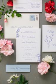
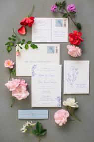
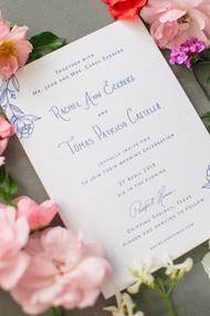
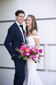
From Nichols Photographers… This Modern-Meets-Classic wedding looks almost too pretty to be real! Rachel and Tomas’s wedding was designed to perfection against the minimalist, clean palette of the Prospect House in Dripping Springs, Texas. Clementine Botanical brought in vibrant pops of pinks, complimented by pale blues, which added a soft, feminine touch to the modern architecture of the venue. And how about that flower wall?! Such a gorgeous backdrop. The bride and groom brought their classic style with a sleek, off-the-shoulder gown for her, and black-tie for the him.

After an outdoor ceremony with the Texas Hill Country as the backdrop, guests enjoyed a breezy cocktail hour before moving into the modern reception space, made warm and inviting with candlelight and vibrant floral design. This wedding was perfection in every way.

Photography: Nichols Photographers | Event Planning: Bird Dog Wedding | Floral Design: Clementine Botanical Art | Invitations: Percolator Letterpress | Catering: The Peached Tortilla | Hair and Make Up: Designs By Janet Suzanne | Ceremony Music: Terra Vista Strings | Wedding Venue: Prospect House | Dessert Stands: Melody's Joy | Bride's Dress: Robert Bullock | Cake/Dessert: Walton's Fancy & Staple | Cocktail Music: Mariachi Amor | Linens: BBJ La Tavola | Reception Music: Matchmaker Band | Rentals: Loot Vintage Rentals

15th Century France Chapel Wedding at Clubs at Houston Oaks

Combine the beauty of Texas and the charm of a 15th century chapel (brought over from France!) and you’ve got today’s fete planned by Stephanie Hubbell with Piper and Muse Events and captured by C. Baron Photography. Sophia and Gumaro have the kind of love that glows and jumps right off the page and I have no doubt that their contagious smiles and sweet celebration will brighten your day.

From C. Baron Photography… Sophia and Gumaro’s were simply destined to meet. Sophia signed up for a speed dating network and accidentally signed up for the wrong age group, never in a million years did she think she would meet Gumaro. Their love is gushing in every photo and it was a pleasure to witness their love story.

Their taste is impeccable too! The Clubs at Houston Oaks has a sense of old English style with their gorgeous 15th century chapel brought over from France, their gorgeous lake and the clubs that surround the grounds. We have thoroughly enjoyed their choices in floral and colors. They both radiate style and elegance!

[iframe https://player.vimeo.com/video/344597969 600 338]

Photography: C. Baron Photography | Videography: Mia & Taffy | Event Planning: Piper & Muse | Cake: Cakes by Gina | Invitations: Lavender Paperie | DJ: LG Events | Officiant: We Do I Dos | Transportation: Jordans Limosines | Bridal Store: Whittington Bridal | Cocktail Hour Florals and Lanterns: Elemental Floral Events | Event Venue: Houston Oaks Country Club | Floral and Rentals: Johanna Terry Events | Gown Designer: Essense of Australia | HMU: Nyoka | Linens & Chargers: Eb Inc Events | Photo Booth: ShutterBooth | Strings & Mariachis: Avalon Music: Los Gallitos

Chinoiserie Garden-Themed Wedding Inspiration at McGovern Centennial Gardens

When Kelly Doonan Events and Mibellarosa Designs set out to create an editorial inspired by Chinoiserie, they took a traditional interpretation and crafted a modern fine art take on this aesthetic. From the Bride’s dress and the stationery to the ceremony backdrop and the draped reception scene, crawling florals are woven into every inch of this inspirational bliss. There’s an abundance of detail to savor, thanks to Josh & Dana Fernandez.

From Kelly, owner ofKelly Doonan Events… Together, working and co-designing with Phuong of Mibellarosa, our inspiration was to take the Chinoiserie style and apply a fresh palette of colors that aren’t normally utilized together in traditional fine art weddings. We chose to focus primarily on shades of teal and aqua, with assists from peaches, pinks and mauves. While remaining true to the Chinoiserie tradition, the final outcome of the shoot illustrates that a muted color palette isn’t always required in order to achieve the look of fine art refinement.

For the ceremony, Phuong of Mibellarosa sought to mimic Chinoiserie style wallpaper by painting three panels with flowers, including fluffy cherry blossom branches, phalaenopsis orchids, roses, hydrangeas, wisteria, carnations and baby’s breath. She wanted to portray the feeling of the trees and flowers commonly seen on the wallpapers coming to life and blooming straight out of the walls. Sleek, creamy velvet chairs with gold legs were brought in by Johanna Terry Events to provide a pop of color, complementing the park’s green lawn and to draw the attention of the viewer down the aisle to the floral panels. The colorful panels also created the perfect backdrop for the cake. 

Becca of Becca Cakes Dessert Design created a wedding cake design combining a variety of textures and colors to bring the Chinoiserie inspiration into a three-dimensional form. The base is champagne gold with bas relief birds and floral textures. The ruffles on the bottom tier are layers in shades of teal, turquoise and mint to bring a pop of color inspired by the beautiful chinaware on the tablescape, as well as to add dimension and texture. The cake is dressed with an arrangement of handmade sugar flowers in shades of white and blush. To compliment the wedding cake Becca also created a small groom’s cake, which is further inspired by the tablescape. It is a mint blue with the same bas relief birds and floral textures used in the wedding cake. The birds are accented with champagne gold and the cake is wrapped in a sugar flower vine of greenery and peachy-pink climbing roses. 

Johanna Terry Event’s team constructed a structure draped in lavender grey chiffon to create a romantic setting for the long head table dressed with rose velvet linens from La Tavola. Mibellarosa created floral compotes with cherry blossoms, roses, Japanese pieris, chocolate lisianthus, pink snowberry, snapdragons, nerine lilies, carnations and bleached fountain grass. An installation of cherry blossom branches, peach phalaenopsis orchids, curly willow and smilax hung over the table adding a bit of whimsy. Phuong’s team also draped the posts with greenery and peach roses to mimic climbing roses. A hand-painted urn sat at the bottom of the vignette to complete the look. The table was topped off with various designs of fine china and flatware from Berings. The china was chosen with special care to incorporate the various colors of the bright palette yet with various patterns so that it would not be one-note.

The bride’s Monique Lhuillier gown on loan from Casa de Novia with its beautiful ivory velvet ribbon and lace detailing that mimicked the shape of flower blossoms was a wonderfully dramatic addition to the overall look of the shoot. Hey Lovely Makeup complemented the elegance of the gown with a sweeping updo as well as to show off the deep neck line and intricate lace pattern.

Phuong from Mibellarosa, created a posy of fluffy pale peach and blush ranunculus, anemones, sweet peas, nerine lilies, and carnations to keep the look modern, sleek and elegant to complement the gown. Pale peach chiffon ribbons by Frou Frou Chic accompanied the bouquet and then finished off with an exquisite gold bird brooch.

With Chinoiserie style as the muse, Dionne from Nib and Pixel knew that flowers, birds and trees were an absolute must when designing the invitations for this shoot. The colorful, pastel twist on historical Chinoiserie design was a fun, but chic take on the usual royal-blue-and-white interpretations we had seen trending in wedding design in the last few years. The suite was not only inspired by Chinoiserie motifs in art, but also took a cue from Chinoiserie furniture design, with the inclusion of brass semi-circle hardware, similar to what you’d see on Chinoiserie chests and tables (these can be seen in the invitation clips, and also on the envelope flap). To add in some texture, the place cards included Japanese stab-binding on the top of each card. 

[iframe http://www.youtube.com/embed/s9wyw2GSwE4 600 338]

Photography : Josh & Dana Fernandez | Floral Design: Mibellarosa Designs | Cakes: Becca Cakes | Makeup and Hair: Hey Lovely Makeup | Bouquet Ribbon: Frou Frou Chic | Branding Film: Josh & Dana Fernandez | Bridal Boutique: Casa de Novia Bridal Couture | Bridal Shoes: Bella Belle | Ceremony & Reception: Mcgovern Centennial Gardens | Diamond Engagement Ring: Trumpet & Horn | Earring Ring Box: Bark and Berry | Engagement Ring Box: The Mrs Box | Gown Designer: Monique Lhuillier | Linen Designer: BBJ La Tavola | Linens, Chairs, Tables, and Pipe and Drape Build: Johanna Terry Events | Model: Rachel Lapierre | Paper Goods & Calligraphy: Nib And Pixel | Planning : Kelly Doonan Events | Tablescape Items: Bering's | Wedding Ring Box: Voeu Du Coeur

These Featured Designers are members of our Look Book.
For membership information, click here
Whimsical & Romantic Barn Wedding Inspiration at The White Sparrow

If you’ve been on the hunt for the perfect white barn for your Big Day, look no further! The White Sparrow is such a gem of a spot and once you see the inspiration below from Laylee Emadi’s LEP Workshop, I have a feeling you’ll be adding this venue to your wish list. Laylee, along with Alexa Kay EventsOlive Grove Design and the entire vendor team created a delicate and whimsical blueprint graced with the loveliest palette. Feast your eyes below and here in the full gallery!

Two souls intertwined—a new beginning as two hearts become one. Nothing can compare to the bright and cheerful joy of young loves becoming husband and wife. This editorial captures the delight of of a budding love story: romantic and whimsical, yet delicate and refined.

The White Sparrow sets the stage for an elegant celebration, featuring a romantic head table with flickering candles, a whimsical centerpiece, and spring bud vases atop velvet linens. The gold-filigreed place settings elevate the design and complement the soft color palette.

Outside, a sweetheart table set for two. Amidst the lavender fields, the bride and groom can enjoy a private meal together, with minimalist place settings and warm-toned floral arrangements to bring the space to life.

Paper details, a gold-foiled cake, and loosely arranged greenery add thoughtful detail to the event… from delicate calligraphy script to a carefully arranged bouquet, each piece ties into the romantic feel of the couple’s celebration.

The bride and groom bring a joyful personality to the occasion: she, twirling in a fresh bridal look (from elegant gown to upswept hairstyle)… he, smiling from ear-to-ear. And of course, their sweet pup as witness to the celebratory occasion!

The happy couple dances across The White Sparrow’s floorboards, exuding joy with every glance at each other…. A young love as bright and cheerful as the spring season.

Photography: Lauren Marks Photography | Floral Design: Olive Grove Design | Cake: Bella Noel Bakery | Ring: Local Eclectic | Hair + Makeup: Brite Bar Beauty | Invitations & Calligraphy: Sarah Ann Design | Wedding Venue: The White Sparrow | Bride: Brailey Smith | Dress + Jewelry: Wed Bridal Boutique | Event Planner/Designer: Alexa Kay Events | Film Lab: PhotoVision Prints | Linens: AM Linen Rental | Rentals: Top Tier | Rentals: Warehouse Rose Events | Silk Ribbon: Oh Be Joyful | Veil: Kathryn Ann Bridal | Workshop Educator: Laylee Emadi Photography | Workshop Host: Laylee Emadi Photography

An Emotional Wedding Day That Reminds Us All What a Wedding Is Truly About

As I opened today’s submission for the first time, I saw the image directly below—captured so beautifully by Phillip Van Nostrand—and I balled my fist up and hit my desk several times with tears rolling down my face. Pure emotion pouring out of me and exactly why this celebration of life and love will go down as one of the most beautiful weddings I’ve ever had the honor of editing. Jacqueline Events & Design tells the story below so graciously. Beyond the dress, the flowers, the details… this, my friends, is truly what weddings are all about.

From Wedding Planner, Jacqueline Events & Design… On October 5, 2018, at 11:00am, Devan Roughton and Haden Shibley became Mr. and Mrs. This is a wedding that will forever define my career. For what you don’t realize is that this wedding was actually scheduled to occur on February 23, 2019. The mother of the bride, Kayla, had lived with ovarian cancer for many years and was very strong when we started this process just one short month earlier. However, on September 27, I answered a call from Devan as she softly explained that her mom had taken a turn for the worse overnight and would be put on hospice at home immediately to live out her remaining days. While sweet Devan thought that her mom wouldn’t be able to enjoy her wedding day, I reassured her that all hope was not lost. I told her that we in fact could allow her to have her mom at her special day and I cast a vision for what became October 5. We had eight short days to pull together the most memorable wedding of my career. Only two vendors had been previously booked, venue and band, and both allowed us out of our contracts and we started from scratch.

When discussing goals and objectives of the client, it is simple – to get married and have the mother of the bride in attendance. To gather the closest friends and family members of the couple in a celebration of love and life. While many of our clients may focus on the more fleeting things of life, this client understood what their special day was really to be about. It truly was the wedding of the year for the Jacqueline Events team.

Devan Roughton was full of pose and grace throughout the entire process. Haden Shibley was the rock she needed and the support system for all decisions made. When discussing where they could get married in eight short days, there was truly only one option – the family home. Her mother was not able to travel and in an effort to accomplish the number one objective, we would have to make the home work. When the decision to move the wedding date abruptly came, I started with a site visit to spend time with my bride. My focus had to be about not compromising what she had dreamt about for her wedding day, while keeping in mind the ticking clock that we were up against. Each day of planning started with a text to Devan asking how her mom was doing. Always afraid that the answer may be that she passed last night. This was my relationship with my bride. It was beyond traditional, it was special and coveted.

Devan’s family owns an art gallery next to their family home and from the minute I walked in the door, I knew it was the perfect location for the 50 person ceremony. It was the history and future of their family. If walls could talk, they would share happy memories that were made of a family working together. We were able to give them another happy memory in the mist of sorrow. While the wedding was planned in eight short days, every detail was thoughtfully orchestrated for the perfect wedding. When working with ministers, we understand that there is a standard script that may be followed. Not this wedding! The minister, Nicholas Costello, wrote a custom ceremony and message just for the bride and groom. It was tailored to the family’s art heritage and how paintings reflect love and life. At the end of the ceremony, the mother of the bride chose to recess down the aisle. It was after this moment that she personally greeted every guest. This was a happy moment and one that was somber. This was the goodbye moment for many friends, it was their final opportunity to speak with Kayla. It literally took every ounce of strength that she could muster up to speak with everyone and take photos with the happy couple. Upon the conclusion of these activities, prior to the reception starting, Kayla left the party and went back to her room where she lived out her remaining days.

After the ceremony the celebration continued with cocktails on the patio and poolside. Brunch was served in the transformed living room. Read below and enjoy all of the special details and learn how the wedding was seamlessly produced.

This wedding will be one that I will always remember. It meant putting aside the perfect wedding timeline, putting aside what we know weddings to be, and giving the couple all that they needed. After living this special day with the couple, I feel as though we will forever be bonded. One week later, Kayla passed with the happy memories of her daughter’s wedding. It was something she talked about up until her passing. That is why we do what we do. That is why we listen, design, and plan the details. It is to make a lasting impression on a family. For this, I am very blessed. This is a wedding unlike any other that will ever occur – it is truly the wedding of the year.

VENUE: When discussing where Devan and Haden would get married in eight short days, we selected a location that was personal and sentimental. We selected their family home. The home consisted of an additional art gallery structure on the side of the property. This would become the ceremony location. The home itself served as the reception location. When designing the wedding, we aimed to compliment the space and not compete with it. The home was built with an Italian villa design and filled with valuable antiques. As you can imagine, the artwork was exquisite. Therefore, the white lush floral desired by the bride was a beautiful landscape for what was already existing. Every inch of the home was used for a different experience. The guests flowed from one space to the next with ease. Guest parking was overseen by a valet service and guests ascended up the stairs to the art gallery. Upon the completion of the ceremony, guests spilled out onto the patio and around the pool. This is where the first dances took place and the cake was cut. After cocktail hour was enjoyed by all, the doors were opened and guests filled what was once a living room. Transformed into an opulent brunch setting, guests remained in this space until a final farewell was given.

Many challenges were faced and overcome within these locations. First is the actual space available. While our sweet bride felt that no one would attend the wedding with this short of notice, everyone said yes. We had 100% attendance resulting in 50 people. However, an obvious space to seat them wasn’t available. We overcame this by looking at rooms in the house not as they were currently setup, but imagined what they could be. We transformed the art gallery into a ceremony through removing furniture and creating an altar out of the fireplace. For the brunch, we looked at the living room in a new light. Removing all living room furniture, we maximized the space with two long family style tables. This also allowed the party to feel intimate and made everyone feel special by being seated together. The second challenge we ran in to was the stairs. This was a twofold issue. First was navigation of load in. Catering was able to create ramps that were used to roll their food carts up into the home. The second issue was how we would move the mother of the bride into the art gallery for the ceremony from her bedroom. While she could walk with assistance, the trek was too far to make at once. We overcame this issue by carefully watching the timeline and starting her move early. She went to different rooms in phases and would gather her strength in between. It was truly exhausting for her, but worth it all when she saw her daughter walking down the aisle.

FOOD + BEVERAGE: The time of the ceremony and wedding was designed around the couple’s favorite meal, brunch. They love having brunch together and we felt it was the perfect meal to share with their family and closest friends. Bringing on Wolfgang Puck Catering to pull off this feat in one week was a simple choice. We knew that they could customize a menu to the liking of our client.

Catering details started as soon as the guests exited the ceremony. They were greeted by an assortment of hors d’oeuvres. Mini quiche lorraine bites, french toast sticks, smoked salmon pizza, and deviled quail eggs were enjoyed by all. In sentimental fashion, the wine served at the wedding was from the wine cellar in the family home. This paired with a mimosa and aperol spritz where passed on trays as they entered the cocktail patio. The aperol spritz delivered a punch of tangerine while the mimosa served up a soft yellow palette for the trays.

Once guests entered the home, the real feast began. A three-course brunch was customized for Devan and Haden in two short days. The first course was a caramelized fig and manchego salad served on a gold fleur plate that completed the preset chargers from Top Tier Event Rentals. Displayed on the table was an assortment of muffins and breakfast breads on white cake stands. It elevated the food from being displayed in a bowl and created dimension on the table design. The second course was the favorite of the couple and one that was not the easiest choice for large group service. All guests received an eggs benedict on a gold rimmed plate and sides were served family style in white bowls. The sides consisted of roasted potatoes, applewood smoked bacon, and fresh fruit. We loved the component of a plated main dish with passed family sides. It reiterated the formality yet closeness of the party. For the third course, guests enjoyed the cake that was previously cut by the couple. They couldn’t choose between three flavors, so we did them all. This was a celebration of love and life after all. Vanilla, snickerdoodle, and chocolate cake served on a white braided dessert plate capped the perfect meal.

PRINTED MATERIALS: While working with couples, we say that to be formal in tradition you should send a printed invitation in the mail. However, what if you don’t have the time? Guests at the wedding of Haden and Devan received something even more special, they each received personalized phone calls. These calls invited them to a day of celebration of love and life.

At the ceremony, the bride wanted to break tradition and not have programs. She felt since it was an intimate gathering of family and close friends there wasn’t a need for that formality. However, for their guest book, the couple chose a beautiful coffee book titled Earth From Above. It is something they now display in their home and enjoy the notes of sentiment left throughout the pages.

As guests entered into the brunch portion of the morning, the custom designed menus by 5by7 Designs also stated their place cards. On the top of each card was the name of the guest written in orchid colored cursive font. This allowed them to know where to be seated and what they would be served throughout the culinary experience.

DECOR: Seeing the beauty of the home, we desired for the décor to highlight and not compete. The bride wanted her favorite color purple to be represented along with her mom’s favorite flower which was an orchid.

For the ceremony design, we brought in gold chairs that accented the gold frames already found on the artwork displayed in the gallery. A lush floral runner was placed on the mantle with draping orchids. A beautiful work of art was on the mantle accented with the glamorous floral. It was truly a magnificent piece. To the right of the mantle we placed the crystal unity candle on a lucite pillar so that it did not demand attention and distract from the floral. The room was filled not only with chairs, but with beautiful piano music played by Luana Stoutmeyer. For us, design isn’t just floral, it is what the senses experience throughout an entire event. The sound filled the room with warmth and celebration.

When designing the cocktail hour, we wanted to be respectful of the furniture that was already in place and chosen by the mother of the bride. We added accent floral pieces to the patio furniture. A guest book table was adorned with a textured white linen that allowed guests to sign at their convenience. In addition, we placed the cake in cocktail hour. Since the guests would be seated and remain seated once entering the home, we wanted the cake to be adored during this time. For the cake table, it was covered with an orchid purple velvet linen that served as a foreshadow for what was to come. A crystal cake stand was selected for the glamor and height it allowed. When designing the cake, we incorporated a replica of the lace from the bride’s gown. This is a gown that will forever hold a special place in my heart because it is the day that I had to take off my traditional planning hat and play the role of friend and mom. When we realized the wedding was being moved, we knew the bride’s previously ordered gown would not arrive in time. After the site visit, I took the bride to a store that had the opportunity to overnight gowns to us. The bride fell in love with this silhouette and lace which she ended up loving more than her original gown. We bought it on the spot and it was in her hands the next day. It was a special memory and one that played a role in the design.

The design for the brunch portion of the wedding celebration was created with community in mind. The guests moved into what was typically the living room for brunch. All furniture was moved out and two long tables were designed to seat exactly 50. It was important to the couple that everyone know how special they were to them and they wanted that reflected in the seating arrangements. It was two family tables full of love. The layout was constructed of 24’ runs of tables. This maximized every inch of space available in this room. It was the largest room we had to work with and we made it an ideal setup. The room was adorned with large white floral pieces that contained draping orchids. A floral runner continued on the table intertwined with candlelight. All of this beauty was supported by a soft oatmeal velvet linen from Nuage. In selecting this linen, it was important to us not only that the color was perfect but that the texture was something the mother could rest her arms on if she was to join. It was soft to the touch of fingertips. The napkins accented the bride’s orchid purple color she desired in the design. Folded on the plates, the napkins sat underneath the custom designed menu cards. The menu cards served as a place card as well and coordinated with their orchid text. The accent metal was gold and could be found in the chairs and flatware. Gold highlighted some of the antiques and artwork already found in the space. It was a flawless compliment.

UNIQUE SUPPORT ELEMENTS: While the original wedding included the special elements of lighting, staging, and A/V components, this was different. When the wedding was moved to eight days away the couple turned their focus to what was truly important, the commitment they would make before God and their parents. Unique supporting elements for this design went beyond what could be viewed, to what was felt. It encompassed all senses. The sound filled the space with warmth and was customized with their favorite songs. The smell was that of orchids and draping floral. The taste was that of the couple’s favorite brunch foods. The touch was of soft velvet for the mom’s comfort. The sight was not only the amazing décor, but that of a young couple overjoyed with their special day. Although it was not the original plan.

ENTERTAINMENT: One of the obstacles was space. Keeping this in mind, we chose to select a solo pianist that would be able to move effortlessly from ceremony, to cocktail hour, and into the brunch reception. Luana Stoutmeyer was the obvious choice and she poured her entire heart into this wedding. In order to set the scene for how emotional of a day this was for all involved, Luana played the processional for the parents to walk in to. After seeing the mom struggle to make it down the aisle and her daughter walking in looking like an angel, she began to cry. There were many tears shed that day by all vendors involved. This is what makes this wedding so different from those we experience on a monthly basis. While the design is still stunning, it is about the heart that was poured into this wedding that truly makes it a wedding of the year.

Luana met with the couple the day before the wedding and played their first dance songs for them to hear. They were overjoyed and very excited for the next day, their wedding day. What they didn’t know is that Luana had gone the extra mile and hired a vocalist to perform for their first dances. As the couple became the center of attention and began dancing to The Promise, a vocalist filled the air. What made the moment even more magical was that while the mom couldn’t attend the first dances due to the exhaustion of the ceremony, she was in the room directly above the pool and was able to experience the moment through sound.

Photography: Phillip Van Nostrand | Event Planning: Jacqueline Events & Design | Floral Design: Haute Floral | Wedding Dress: Reformation | Cake: Annie's Culinary Creations | Catering: Wolfgang Puck Catering | Wedding Venue: Private Estate | Beauty: Simply Beautiful By Meg | La Tavola Chairs: Top Tier | Linens: Nuage Designs | Menu/Place cards: 5 By 7 Designs | Piani: Luana Stoutmeyer | Valet: Gold Crown Valet | Veil: Arte Latica

These Featured Designers are members of our Look Book.
For membership information, click here
How To Achieve The Perfect Bright and Coastal Design

It’s no secret that we love a bright and airy home! As the weather warms (finally!) and summer nears, we are even more drawn to the sunny, coastal decor trends that are starting to fill our feeds. But don’t worry, this style isn’t just for those lucky folks with homes on the beach! So how do you approach that laid-back, beachy feel no matter where you live? Interior stylist and designer, Maureen Stevens is here with a few tips on “How To Achieve The Perfect Bright and Coastal Design” and she is sharing a few of her favorite pieces to help get you started.  Her design approach centers on “making subtle changes to your surroundings to give you a totally different experience” and that is right up our alley!

1. Add art reminiscent of the beach…

Artwork is a fun way to bring coastal beach vibes in your home. There are so many different prints with beach umbrellas, people sunbathing, aerial views of the ocean, etc., that will instantly brighten up your home and make it feel like a chic, summer escape.


2. Think organic materials…

Natural materials that remind us of the outdoors are a great way to bring coastal design into your home. From raffia to rattan, jute, acacia and the like, there are so many materials to choose from. Rather than over-doing it and replacing big furniture items with those which are made of these materials, you can incorporate smaller pieces like accent chairs, nightstands, side tables, etc.


3. Choose a color palette that mimics the nature of the coast…

Changing the color of your walls can make a huge impact on your home. By toning down any loud and vibrant colors by replacing them with calming hues, such as taupe or white sand, the colors of the ocean, driftwood, etc., your home will feel lighter and brighter instantly.


4. Go for billowy on your windows…

By implementing light and airy curtains into your home, you’re one step closer to achieving an effortless, coastal design. The light-weight fabric will ebb and flow when a breeze hits them, creating an ocean-breeze effect you’ll love.


5. Focus on negative space…

One of the things that makes the coast so beautiful is its vastness. It’s important to bring this sense of space into your home, as well. Sometimes, less truly is more when it comes to design. Cluttering can create a stressful environment, whereas minimalistic design can contribute to a more relaxed, enjoyable space.

6. Whites, whites, whites…

Have I stated white, and lots of it, yet? Whether it’s wall color, bedding, furniture, or textiles– you name it– white is always a good option. Incorporating different shades of white will open up your home and make your space feel clean and refined, epitomizing California-cool living.


GET THE LOOK

Ready to brighten up? Maureen Stevens is sharing a few of her favorite pieces to help get you started!

1. Large Coastal Art Print / 2. Belgian Linen Sheer Curtain / 3. Montecito Pillow Cover / 4. Large White Planter / 5. Shroom Coffee Table / 6. Reclaimed Wood Console / 7. Brighton Table Lamp / 8. Reclaimed Wood Storage Bench / 9. Medan Chair / 10. Chunky Hand-braided Rug 


Interior Design: Maureen Stevens

5 Ways To Use Pantone’s Color of the Year ‘Living Coral’ in Your Modern Wedding

As much of a neutral lover as I am, my color kryptonite is coral. So, you can imagine my elation when Pantone announced Living Coral as their color of the year. I knew we’d be in for a dose of vibrancy in weddings and today’s slice of inspo from Lauren Field Design and Kristin La Voie Photography nails it. Read on below for five innovative ideas on how to infuse this vibrant, happy hue into a modern wedding with a wow-worthy palette.

1. Wear it!

Make a statement by starting with the decision to wear a colored gown. This unique Elizabeth Dye wildfire gown was the perfect way to incorporate such a bold statement piece. Be sure to select simple accessories to allow the gown to take the full spotlight.

2. Choose a neutral colored venue

Select a venue that will allow the color to shine without being too busy. The Prospect House gave us such an opportunity with it’s simple yet elegant spaces that have a grand light filled quality to them. By creating focus around the features we admired most, we were able to seamlessly blend our colorful vision for this modern fete.

3. Pair with analogous (adjacent) colors on the color wheel

Infusing the palette with colors that have a similar underlying tone with varied hues (like magenta, rose quartz, etc) help to draw attention in a visually pleasing and exciting way. There is nothing boring about this color combo!

4. Set a baseline of decor with dark, light, and translucent elements

Combining architectural elements of various luster and matte finishes, the color can feel bold yet well curated. We incorporated high gloss tableware with a smooth matte velvet; translucent ghost chairs atop a matte concrete floor to create visual interest.

5. Choose florals that include preserved elements with minimal greenery

Balanced textures and unique pairings (like the dyed fan palms, bleached Italian ruscus, and bright anthuriums) help a composition remain innovative and unique, while totally logical. Hints of unexpectedness help bring your overall concept up a few notches!

From Lauren Field Design… Inspired by the intersection of modern architecture/abstract art and the evocative use of shapes, forms, and color (or lack thereof) inherent in both mediums, we wanted to reflect the simplicity and visual order of layering texture in a refined yet dramatic fashion.

At The Prospect House, the captivating display of simple materials, lofty exposed structure, and abundant natural light provide a stunning backdrop reminiscent of an art gallery. These experiential characteristics of proportion, scale, and light/reflection became driving factors for all aspects of the design.

We selected a palette of tone-on-tone hues of jet black and charcoal infused with varying shades of living coral. The high contrast decor was paired with architectural accents of concrete, mixed metals, and translucent elements as a nod to the thoughtful architecture of the venue. The ceremony installation was meant to channel the poetic brushstrokes of an abstract expressionist painting. For the table, we chose a charcoal velvet tablecloth layered with luster glassware, matte black flatware, and colorful asymmetrical arrangements influenced by the art of Ikebana flower arranging. The cake was a dark silhouette of impressive texture atop lucite on a dramatically high table with an avant-garde vibe.

The bride and groom were both dressed in elegant silhouettes with a bit of modern flair; the groom in a velvet jacket, the bride in a runaway train of tiered tulle. The bridal look was feminine yet edgy with a classic chignon to showcase the statement of the gown.

Photography: Kristin La Voie Photography | Florist: Remi and Gold | Gown: Elizabeth Dye | Cake: Jessica Fuller Cake Art | Shoes: Bella Belle | Hair & Makeup: Süße Poesie | Tuxedo: The Black Tux | Venue: Prospect House | Design & Planning: Lauren Field Design | Linens: Nuage Designs | Paper Goods: Letters by Lane | Rentals: Peerless Events and Tents

These Vendors are members of our Little Black Book.
For membership information, click here
Classic & Elegant Texas Wedding at The Grand Ivory

The very first thing on my wedding planning wish list was a gorgeous venue. A gorgeous white venue to be exact. There’s nothing quite as fresh and classic as a clean backdrop and today’s spot, The Grand Ivory, is all that and more and fulfilled the vision of Ann and Quan—with the help of Pop Parties. To document their celebration, they called on Allen Tsai and Brad & Monica Wedding Films and I’m SO glad they did, so we can all be be virtual guests!

From Allen Tsai PhotographyAnn and Quan wanted a clean, classic, and elegant wedding and they sure achieved it with the perfect design from Pop Parties! The Grand Ivory was the perfect backdrop for their wedding with the clean walls and beautiful natural lighting. Paired with lush greenery and touches of white and blush floral design by R Love Floral, it truly brought their wedding vision to life!

For the classic and elegant touches, Ann wore a stunning Vera Wang gown and had all of her bridesmaids in gold sequin gowns. Quan went with the classic black tux and bowtie look.

The reception design was the perfect balance of everything. The aisle floral pieces from the ceremony were re-purposed onto the head table creating a lush greenery organic vibe. The tables were a mix of long rectangular wooden tables with low floral arrangements to keep the organic look consistent, but also mixed in with round tables featuring tall centerpieces with blush and ivory linens to create that elegant look. The couple chose to serve Babes Chicken, their favorite restaurant while together and it truly was a wonderful celebration from start to finish!

[iframe http://player.vimeo.com/video/263402524 600 338]

Photography: Allen Tsai Photography | Cinematography: Brad & Monica Wedding Films | Planner: Pop Parties | Floral Design: R Love Floral | Cake: Fancy Cakes By Lauren | Catering: Babe's Chicken | Hair and Makeup: Daniela Bell Beauty | Officiant: Love Notes | Transportation: Echo Transportation | Wedding Venue: The Grand Ivory | Bridal Gown: Vera Wang | Entertainment/Lighting: Le Force Entertainment | Film Lab: Goodman Film Lab | Linens: BBJ La Tavola | Photobooth: Joy Squad | Rentals: TLC Event Rentals

These Featured Designers are members of our Look Book.
For membership information, click here
A Colorful Fall Wedding at Hotel Crescent Court Complete with the Cutest Flower Girl

For this beautiful couple – the perfect wedding day meant the presence of their closest family and friends, subtle tributes to their military backgrounds, lots of bright yellow and pink blooms from Anna Rayner… oh, and the cutest four-legged flower girl we ever did see. It was the most special day planned perfectly by Keestone Events! We can’t wait to share these gorgeous photos captured by Allen Tsai Photography of Tian Tian and Chris’s joy-filled day! See it all below and prepare for some majorly aww-worthy moments.

From Keestone EventsI loved planning for Tian Tian and Chris. This is a couple who aren’t afraid to let their personalities shine through and have fun.

From Tian Tian surprising Chris by arriving at the rehearsal in a taco costume (their wedding was a few weeks before Halloween) just for kicks — she did take it off after a few minutes — to Chris surprising her with Torchy’s Tacos as a late night snack at the reception, there were twists and turns throughout their wedding that kept their group of guests guessing and cheering all night long.

Both met in West Point and were in the military for five years. They incorporated aspects from that background such as cutting the cake with the West Point saber and doing a military style grog. For their wedding, the couple was drawn to bright florals which were balanced out with neutral linens and the warm tones of Hotel Crescent Court.

Tian Tian and Chris don’t live in Dallas and they, along with most of their guests flew in from various parts of the States to make it to their big day. Since Tian Tian’s family is from China, red wooden favors that mean “double happiness” were put on each place setting as a nod to her culture. I also cannot forget to mention Sandy, Tian Tian’s Old English Sheepdog who has been the most well-behaved (and supportive) flower girl in all the weddings we have done. Sandy was such a pro and MVP!

Photography: Allen Tsai Photography | Floral Design: Anna Rayner | Dress: David's Bridal | Cake: Panini Bakery | Stationery: Minted | Hair and Makeup: Jessica Jieun | Ceremony + Reception: Hotel Crescent Court | DJ + Lighting: Le Force Entertainment | Planning + Design: Keestone Events | Rentals: Big D Party Rentals

An Ethereal Garden Wedding at The White Sparrow Barn

The oh-so talented team at Moss Floral Design brought an ethereal garden scene indoors at The White Sparrow Barn – and the result was absolutely magical. Abundant greenery and a feminine color palette of soft pinks, blush and mauve danced across the barn’s blank canvas. The entire day planned by Ivory and Vine Event Co. was nothing short of a dream. Don’t miss a single moment of this enchanting affair at the full gallery of images captured perfectly by the always lovely, Stephanie Brazzle Photography.

From Stephanie Brazzle Photography… Ashley & Chad’s winter wedding was intimate, romantic and full of gorgeous details. Ashley and I began dreaming up her wedding with a palette of soft pinks, blush, muave and overflowing greenery, bringing an ethereal garden aesthetic to their stunning white barn venue, The White Sparrow.

The barn gave us an elegant, clean canvas to paint on, and we filled it with soft candlelight, french-inspired details like hand-monogrammed napkins for each member of the wedding party, and luxurious velvet textures. Moss Floral Design juxtaposed soft, refined garden roses with wild smilax, and added pops of deep pink, mauve and amber to contrast the bright, airy wood of the barn.

Ashley’s custom stationery suite designed by Scribbles and Swirls, incorporated a crest with French detailing, and nods to the anemone that were sprinkled throughout Ashley’s bridal bouquet and the arrangements that adorned the velvet-lined tables. Guests were nestled into the barn during a cozy, candle-filled ceremony, the barn doors open to let in the cool air and the sound of rain falling on the leaves outside.

After the ceremony, guests enjoyed jazz music, inspired by the couples love of New Orleans, and sipped champagne as we transformed the barn for moody, romantic dining. We wanted to evoke a feeling of closeness, denoted by the soft, plush linens, tall pillar candles and Southern comfort food; a stunning evening spent with close family and friends.

photographer : Stephanie Brazzle Photography | Floral Design: Moss Floral Design | wedding dress: Sareh Nouri | wedding dress : Arte Latica | stationery : Scribbles And Swirls | catering : Vestals Catering | entertainment : Le Force Entertainment | wedding venue : The White Sparrow | Planning: Ivory & Vine Event Co. | Rentals: Bella Acento | Rentals: Beautiful Event Rentals | hamu: Tracy Melton Artistry | jewerly : Shapiro Diamonds | linen: BBJ La Tavola | robe: Lauren Leshansky | wedding : The White Sparrow

These Featured Designers are members of our Look Book.
For membership information, click here
Texas College Sweethearts Wed at The Room On Main in Dallas

As someone who found love in college myself, I’ve got a soft spot for college sweethearts—and today’s lovebirds are simply the cutest pair. Also like my husband and I, Haley and Hunter said I do nine years after meeting and oh, did they do it in serious style. With Engaged Events and Something Pretty Floral to help beautify the day, their Dallas celebration is one I know you’ll go a little pin-happy with. Stephanie Brazzle captured it all, right here.

From Stephanie BrazzleHaley and Hunter met in September of their freshman year at TCU. They remained mere acquaintances until after a couple chance encounters, Hunter asked Haley on their first date. Hunter picked Haley up from her dorm, Colby Hall, and they walked to nearby Dutch’s Burgers, a local favorite at TCU. Despite the first date nerves, they had a great time and began what would be a long journey together that would culminate with their wedding over nine years later.

During the next four years at TCU, Haley and Hunter formed countless friendships and made memories that they cherish to this day. The summer following their graduation from TCU, Hunter moved to Waco to attend Baylor Law School, and Haley started her first job in Fort Worth. They drove back and forth between Waco and Fort Worth nearly every weekend for the following three years. Hunter’s law school graduation was not only significant for Hunter, but also meaningful for Haley and Hunter as a couple, knowing that their future together could finally begin in the same city! To celebrate this milestone, Haley and Hunter spent two wonderful weeks in Italy. During their last evening in Venice while watching boats sail through the canal, Hunter surprised Haley with a proposal. After Haley said “yes!” and shed a few tears, they returned home to share this exciting news with their family and friends.

Shortly after returning home, Haley and Hunter moved to Dallas together, where they began planning their wedding. It meant so much to Haley and Hunter to host their families from all over the country in Dallas. They were married in the Cox Chapel at Highland Park United Methodist Church and the reception was held at The Room on Main. It perfectly embodied what they had always envisioned for their wedding day, a traditional, intimate, and emotional celebration. As the bride and groom arrived at the reception, the sun was setting beautifully through the 15-foot floor to ceiling windows. And as the sun set, hundreds of candles placed on the tables throughout the room illuminated the venue. As the reception came to an end, Haley and Hunter shared one last romantic dance together followed by a grand exit as friends and family tossed rose petals. It was a beautiful night which brought together Haley’s and Hunter’s families and friends for which they will be forever grateful. It was truly a night they will remember forever!

photographer: Stephanie Brazzle Photography | videographer : Jonathan Mayfield Media | wedding dress : Nordstrom | Cake: Panini Bakery | Invitations: Scribbles And Swirls | ceremony : Highland Park Methodist Church | Reception Venue: The Room On Main | catering: Cn Catering | hair and makeup : Anastasia Strattan | lighting : Le Force Entertainment | DJ: Le Force Entertainment | tux: The Black Tux | transportation: Blue Diamond Limousines | accomodations : Hotel Crescent Court | floral: Something Pretty Floral | planning : Engaged Events

High School Sweethearts’ Wedding at The Ivory Oak in Texas

Can you imagine having to change your wedding venue just two months before your big day?! That’s exactly what this duo had to do after finding out their original venue was to be sold—even forcing them to re-send their wedding invitations. Thankfully this wedding planning woe was a blessing in disguise, because if Caitlin Rose‘s images have anything to say about it, venue #2 (The Ivory Oak) made for the loveliest setting. Memory Lane Weddings coordinated the entire day, leaving the Bride & Groom completely free to soak in their celebration. Have a look below!

From Caitlin Rose PhotographyChelsey and Gabriel started dating in high school and have been together for 10 years. They had been waiting years for their big day of finally making it official. The couple wanted a classic southern outdoor wedding in the hill country with bright florals and romantic details.

They picked out a venue just outside of Austin, only to find out that their original venue had been sold. The couple had to pick out a new venue just two months before the wedding! Luckily the Ivory Oak, a brand new southern venue in Wimberley, was available on their wedding date. This was actually the venue’s first wedding! The couple had to re-send out all their wedding invitations with the details of the venue change.

On the day of the wedding, everything went smoothly, everyone was relaxed, and the couple could not have been happier with how it all turned out. The bride wore her mother’s jewelry and a stunning classic lace dress. It was supposed to rain all day, but the rain held off for their wedding. Chelsey and Gabriel could not stop smiling as they officially tied the knot. Congrats to the high school sweethearts!

Photography: Caitlin Rose Photography | Coordination: Memory Lane Event Center | Florals: Wild Bunches | Cake: Classic Cakes by Lori | Invitations: Minted | Bridesmaid Dresses: David's Bridal | Caterer: Trudy's | Make-up: Noelle Ponce-Alivar | DJ: DJ enCore | Venue: The Ivory Oak | Bridal Boutique: Belle Saison | Bridal Gown Designer: Mori Lee | Ceremony Programs: Ink and Veil | Film Lab: The Find Lab | Hairstylist: Keisha Dorty | Ring Box: The Mrs Box

East Coast Style in the Dallas Suburbs

Color, cheer, and function, were the key elements to this interior designer’s new family abode! When Janelle, of Lark Interiors, moved her family from New York City to Dallas for a taste of suburban life, her focus was location, location, location. After finding a mid-90’s home that was less than exciting, Janelle got to work on bringing the home to life – without a total renovation. “I often find that people think the answer to every ailment is to renovate. The power of paint, new light fixtures, and good furniture is totally under-appreciated.” And after touring this house, we agree that the power of paint is real! See for yourself in this home tour photographed by Matti Gresham.

FRONT ROOM

I chose to put our TV in our front room because the New Yorker in me hates to waste space and I knew we’d never use a “formal” living room. I tell people that the gallery wall around the tv is intended to help the TV blend in, but really it’s just an excuse for me to freely hoard art. The pieces are from all over—a couple were my grandmother’s, some are from flea markets, some from artist friends, and some are from Homegoods. I just can’t seem to stop myself from buying a pretty piece of art. The credenza is a vintage piece I bought from my friend Angeline’s shop Purveyor. She always finds the best stuff—and I love to swing by and see what’s new.


FAMILY ROOM

This is my favorite room in the house. It is cozy enough for a Sunday afternoon nap, but has enough seating to host friends. I knew I wanted a Windsor bench behind the sofa from the moment we moved in — but it proved nearly impossible to find one! When I stumbled on this one at Round Top, I had to have it. I’m pretty sure I got it to fit in my car by willpower alone.

The light fixture was another lucky find. The fixture I wanted was out of stock and I needed something immediately for a photo shoot. I found this one at the Arteriors outlet. It was a one-off Arteriors made as a sample, but never ended up manufacturing. When I say good lighting can change a room, this is what I mean. It became the focal point of the space!


DINING ROOM

The one small renovation we’ve made to the home so far is adding the wainscoting in the dining room. It instantly elevated the space. But what really pulled this spot together is that incredible Robert Abbey chandelier. That middle section is solid stone, so more than a few swear words were said when it was being hung, but it was totally worth it!


BREAKFAST NOOK

This is the heart of the home. This is where we eat our meals, do homework, and play play-doh. I love a round table because they are so functional — we can fit up to 8 people around this one by Community Mfg. The chairs are knock-off Marcel Breuer and are so family friendly because you can buy replacement backs or seats for only $30! And that Arteriors chandelier makes me happy on a daily basis!

MASTER BEDROOM

I read somewhere that the more saturated the color, the more joy it will bring you. I believe that. I love color. It makes my heart happy. So I just went for it in here. Because the walls are so saturated, I decided to let them be the star and stick with neutral textile choices. My other favorite thing in my bedroom is the marble topped dresser which I found at Round Top. The lamp used to belong to my husband’s grandfather.


THE GIRLS BEDROOM

My two daughters (8 and 5) share this room. When I talked to them about color, they immediately settled on hot pink. I was initially a little hesitant, but after finding that Kravet wallpaper for the ceiling, I was totally on board. Now we all love it and not even the neighbor boy’s shouts that “it’s burning my eyes!” can dissuade us. Probably my favorite element in this room is the vintage dresser I found at Scout Design Studio. I had it lacquered in Benjamin Moore Simply White, which is the same white that is on the walls. The dresser hardware makes a statement in the best possible way — and it’s Henredon so it’s super high quality. Nothing makes a mom smile like dividers built into the sock drawer!

Bunk beds were a purely practical choice — I wanted the floor space for play. Whenever I need bunk beds for a design, Oeuf is my go-to. Their bunk bed doesn’t feel visually heavy or clunky like a lot of others. And the swing chair is pure fun. It makes a surprisingly comfy bedtime story spot. I will say that the one thing no one tells you when you install one of those is that it is nearly impossible to get it to settle facing the exact direction you want. The OCD part of me has wasted many a moment adjusting it.


THE BOY BEDROOM

The jumping off point for my 12-year-old son’s room was the Kate Roebuck art above his bed. Every teenager needs to be reminded to laugh, right? The desk I found in Canton, a great flea market just outside of Dallas. It was the perfect scale for the spot. My favorite thing we did in this room was carrying the two-toned paint treatment all the way around the room—through the doors, trim, everywhere. It adds great visual interest to our builder basic doors.


THE GUEST ROOM

This is a small room, but we get a lot of visitors, so it has to be practical. I used Rejuvenation sconces instead of lamps to free up space on the nightstands. On one side of the bed I replaced the nightstand with a small desk from West Elm. It provides a perch for your glass of water at night and a place to respond to emails during the day.


THE PLAYROOM

When we moved in, the built-ins in this space were yellowed, scratched, and dated. A fresh coat of paint totally transformed them. I used Benjamin Moore Moonshine, and added Benjamin Moore Gilbralter Cliffs on the back of the built-ins for contrast. The hex knobs from CB2 were a fun addition too. I found the old sign letters at the Round Top Antiques Show. It took me quite a while to put this phrase together—but as soon as I thought of “be nice” I had to have it. Last year we got a piano and I had to move the sign to make room for it. I’m now waiting for the perfect client project to use it in!


Photography: Mattie Gresham | Design: Lark Interiors | Lighting: Arteriors Home | Lighting: Robert Abbey | Lighting: Rejuvenation | Art: Home Goods | Art: Kate Roebuck | Bunk Beds: Oeuf- Sparrow | Dresser: Scout Design Studio | Hardware: CB2 | Kitchen Table: Community mfg | Nightstands: West Elm | Paint: Benjamin Moore's Robbins Egg, High Gloss | Wallpaper: Kravet

Austin Garden Wedding at The Vineyards at Chappel Lodge

Want to know exactly how you get this wedding look without breaking the bank? The gorgeous Bride is breaking it ALL down for us below, including 14 ways they saved money. But first, can we all just take a moment to soak in this tree? With the help of Blue Sparrow Events and Sweetwater Stems, this celebration was the perfect balance of splurges and saves—resulting in this pin-worthy gallery captured by Honey Gem Creative.

[iframe http://player.vimeo.com/video/298286502 600 338]

From the Floral Designer, Sweetwater StemsWe wanted to create floral designs that were truly unique for Ally and Eric – romantic, natural, and timeless. To achieve a garden inspired look, we used a variety of blooms and foliage – including astrantia, ranunculus, roses, scabiosa, blushing bride protea, butterfly ranunculus, pieris japonica, silver dollar eucalyptus, and bouvardia are just a few of the items we selected. We wrapped the bouquets in a wide, dusty blue velvet ribbon – it was perfect! The ceremony space included hand-tied garlands on the chairs along the aisle, and a stunning floral design on the focal tree. We wanted the design to appear as if it were growing in that space, creating that really natural and whimsical look. The reception took place under a beautiful tent adorned with string lighting. To soften the ceiling and create a more warm and inviting vibe, we added loose and natural greenery to the lights – perfect touch! The guest tables included a variety of designs elements including ceramic compotes, candles, geometric terrariums, and gold metal vases. We could not be happier with the overall design for Ally and Eric. It was truly a magical day, and we are so proud to have been a part of making their wedding day so special!

How the couple met… Eric and I met a little over 3 years ago. I was at Punch Bowl Social at the Domain with one of my friends and we were just about to leave when Eric walked in with a couple of his friends. I immediately saw him walk in and couldn’t take my eyes off of him! He was exactly my type and I knew I wanted to talk to him, so I watched him walk around the bar to get a drink and waited to make eye contact. When we did he immediately came over and started talking to us. I felt an instant connection to him and honestly knew I wanted to marry him right then and there. I also found out that Eric and his friends almost didn’t even go to Punch Bowl that night and it was Eric’s last minute decision to stop by before heading home! I truly believe our paths crossed by a chance of fate.

As he was getting my phone number at the end of the night his phone died and he ended up not saving my info! To my surprise I got an instagram message from Eric the next day saying he remembered where I worked and typed in “Blonde Faith Salon Avery Ranch” on google which took him to the website and our employee staff page. During his wedding toast he thanked my boss for including this page because he was able to find my last name and searched for my instagram to get the rest of my number! When we started talking we quickly found out that we were practically neighbors living at The Domain! We had our first date 3 days later and quickly fell in love. We were brought into each others life at the perfect time and fate truly brought us together.

How he proposed… We were in San Diego visiting for a trip and went to Point Loma to the Sunset Cliffs, which is where Eric Proposed. It was so special, romantic and beautiful, the best day of my life.

From the Bride… Getting ready with everyone was such a fun part of the wedding day! I got ready at the venue with my bridesmaids, my mom and mother in law. It was so nice to be able to get ready at the venue and not worry about driving to the ceremony after getting hair and makeup done. If you can get ready at your venue or nearby I for sure recommend it! Make sure to buy waters, snacks like finger sandwhiches, fruit and veggies! And don’t forget the champagne! I gifted my bridesmaids with a cute box they could put all their items in with their initial on them. In each box I had: Kendra Scott Earrings that matched their dress (if you mention you’re getting the earnings for your wedding party you can get a discount on your purchase depending on how many pairs your buying!), a champagne flute that said bridesmaid, maid of honor, or mother of the bride/groom and a pair of silver flip flops to change into later. I also got them silk robes with their names on them. I wanted to get them robes they could wear again, so I choose to put their first names instead of “bridesmaid”. I choose to get robes that matched the color of the dresses and I got my mom and mother in law dark navy colored robes to match the color scheme! I also had the hangers made with their names on them as well!

Choosing the attire for the bridal party was one of the most difficult wedding planning decisions for me. I knew I wanted neutral colors but that was about it. It was hard to make a decision between mis-matched bridesmaid dresses, the suit colors, and the bridesmaid dress colors! Ultimately after reaching out to my photographer and wedding planner (who are both super detail oriented, and a little OCD like me) they helped me make a decision that would look best and flow nicely in photos. Our photographer explained that darker suits always make the dresses pop! So true! Especially against the white dress. And dark colors for groomsmen tend to photograph better and look more “fancy and elegent” She explained her opinion on keeping the groomsmen and groom in the same colors tends to look more cohesive, rather than having the groom in a separate color than the groomsmen. This made me realize I wanted everyone in the same color palettes, because I am lover of all things cohesive! For someone who has her entire closet color coordinated, I don’t know why I was thinking mismatched dresses would work for me… haha. We ended up choosing black suits for the guys and light grey dresses for the bridesmaids! Each bridesmaid got to choose her own neckline, which I loved. They were able to pick a dress that worked best with their body type, and it still looked “mismatched” but with the same colors!

And now….the DRESS! AHH, I miss my dress. I wish it was acceptable to wear it for date night on the weekend. So, I was never one of those people who thought about their wedding dress before getting engaged! So I had no idea what to get, or what style I wanted. But when I tried this one on…I knew! I would recommend trying on all the different styles of dresses until you find one that you like! One of my favorite moments of the day was my bridesmaids “first look” It was so fun to put my dress on and see their reaction! Eric and I didn’t do a first look, so it was really sweet and fun to do something like this with my girls! I loved the lace detail, of my dress and the long train. I added the lace sleeves to match the lace on the dress, and opted for a long veil with lace to match my dress as well!

We got our invitation suite from Minted.com. It was SO easy to use, affordable, and ships fast! They give you 10 free samples, (we ordered like 30 haha) We wanted everything to be cohesive and simple. We used our wedding website for guests to RSVP, and it was a great way to save money on stamps and envelopes! Since we had a smaller guest count I think it worked great. I think guests found it more convenient to RSVP online rather than sending back a response in the mail. One of my favorite decor elements from the day were these marble escort place cards I had made for our head table and the custom seating chart mirror design. I didn’t do assigned seating for each table, instead I did assigned seating for our head table with the escort cards, and then the seating chart mirror to help direct each guest to their assigned table. It saved the headache of assigning each guest to a specific seat, and they got to choose where they sat within their assigned table.

@haleywynndesigns KILLED it on the escort cards and mirror designs. Another awesome thing is being able to use the beautiful mirrors after the wedding! They were super easy to wipe off after the wedding, and look beautiful in our apartment. I got the mirrors from Home Goods! Our florist created the most beautiful floral arrangements and boutonnieres. I wanted simple bridesmaid bouquets, that incorporated the natural elements of our outdoor venue. We had an elegant, tuscan theme for our floral decorations. Since our ceremony site was beautiful, we didn’t have to spend too much to decorate it. Our florist decorated our ceremony tree with a beautiful floral design, and added beautiful greenery to the top of our tent! We created cohesion by adding that greenery to the seating chart, welcome table, and welcome sign. We incorporated a lot of loose greenery, with simple designs for our head tables. We also had little bud vases with simple roses, and candles throughout the reception tables and head table!

I made all of the signage for our wedding from a template on etsy for $10! Click here for the link. I bought the table number frames from amazon, and bought the other frames and easels from Michaels, Hobby Lobby and Marshalls. Instead of a guestbook that we would never look at again, we had custom wine bottles made for guests to sign! Our photo booth was a huge hit! We had a custom marble backdrop (cue the marble escort cards) and I ordered the cutest photo booth props from Amazon from here and here! Such a small investment, that made the night SO fun!

Our wedding planner was a godsend. Having a wedding coordinator for our wedding was the BEST decision. She took so much stress off of us the days leading up to the wedding and the day of. Our wedding wouldn’t have been nearly as beautiful without her.

Our wedding day was without a doubt the best day of my life. During the wedding planning process I worried so much– about all the little details and in the end, it all turned out better than I could have ever imagined. I was so nervous, up until the minute I was standing in front of Eric at the ceremony site. As soon as I was standing in front of him, all of my nerves went away, and I said our vows with confidence and excitement. I have never felt so happy, and joyous in my entire life.

Here are a few ways we saved money on our wedding:

Veil: Purchase your veil from Etsy or from your seamstress. My veil was about $100 vs $400+ at the bridal shop.

Shoes: Again, my shoes were about $60 from Nordstroms. I wore them for 15 minutes and then changed into flip flops. Theres no need to spend $200+ on shoes that you wear for 15 minutes.

Suits: Eric’s suit and the groomsmen suits were all under $250, and they got to keep them. We got them from a local suit shop in Austin! The Black Tux is also a good option!

Pretty Ceremony Site: We saved a lot of money not having to decorate our ceremony site because it was so beautiful even without any added decorations!

Small Bridal Party: Depending on what you are gifting your bridesmaids, and if you’re paying for part of their hair or makeup, I would estimate spending at least $100 per bridesmaid (and thats low). Having only 5 bridesmaids helped us out with our budget as well!

DIY Table numbers, menus, and other signage: Instead of buying table numbers or menus, I downloaded an etsy template and printed them myself using cardstock, and a paper cutter! It cost me about $20.

Inexpensive Invitations: Minted has great options for inexpensive invitations and they usually have discounts during any holiday! Save money on stamps by personally giving the invitation to people you see often.

Linens: My wedding planner from Blue Sparrow Events said that some people spend about $40+ on each table linen! Ours were less than $30 for ALL FIVE of our guest tables combined and they looked beautiful!

Programs: You don’t really need wedding programs. They get thrown away or used as fans

Guest List: We had about 55 people at our wedding. We kept it small by only having very close friends and family at the wedding. We honestly didn’t invite anyone we didn’t have a close relationship with. I wouldn’t have had it any other way. Obviously having a small guest count saves money on food. But also allowed us to have fewer guest tables, fewer linens, less floral decor, less alcohol needed, fewer invitations, and more time to spend with each person and the list goes on. Having a smaller wedding was so great if you can swing it!

Catering: We saved money on catering by having a buffet style dinner and having one entree with a pasta as a “side” rather than having 2 entrees!

Cake: We got a very small cake, enough to feed our guest count perfectly, and didn’t save the top tier.

One location: We had our getting ready, ceremony and reception all in one spot. This saved us money on transportation. We didn’t have to hire any transportation other than our getaway limo for our wedding day.

Bachelorette Party: We choose to stay in Austin for my bachelorette party, which saved on travel expenses for sure!

Photographer: Honey Gem Creative | Videographer: Paper Bird Films | Event Planner: Blue Sparrow Events | Florist: Sweetwater Stems | Wedding Dress: Pronovias | Cake: Kayla Knight Cakes | Invitations: Minted | Ceremony Venue: Vineyard At Chappel Lodge | Brides Shoes: Nina | Bridesmaids' Dresses: Weddington Way | Catering: Dagar’s Catering of Austin | DJ: Infinity Sound Lab | Bridal hairpiece: Top Gracia | Bridemaids Robes: To Happily Ever After | Bridesmaid gifts: Kendra Scott Jewelry | Groomsman Ties: The Tie Bar | Hair & Make-up: Lola Beauty | Photo Booth: We Just Click | Rentals: Premier Events | Seating Chart, Bar sign and Place cards: Haley Wynn Designs | Wedding Dress Boutique : Serendipity Bridal

These Featured Designers are members of our Look Book.
For membership information, click here
A 21st Century Gothic Fairytale at Brazos Hall

This isn’t your typical white-on-white country club summer wedding, ladies and gentlemen… this is oh so much more than that. We are genuinely amazed by the sheer creativity and unique personality that’s pouring out of this stunning wedding. Wild Sky Events and Clementine Botanical Art truly brought every detail of the bride’s vision to life with the 21st century gothic fairytale wedding of her DREAMS! Feather & Twine captured every must-see moment of the day, down to the bride and groom’s adorable pup! Keep on reading to take a peak inside the most jaw-droppingly original wedding ever. 

What were your style goals for your day?

From the bride.. We wanted a whimsical, gothic 21st century fairytale vibe. Hence, the black cake, black plates, and fairy garden floral design. I wanted to be that gothic fairy princess, thus I chose minimalish makeup and a braided hairstyle to pair with my Alon Livné White long sleeve dress.

How did you want your wedding to FEEL?

We wanted the wedding to feel super relaxed and fun and non-traditional. We really wanted our guests to not have to worry the entire weekend. Thus, we made sure the hotels, rehearsal dinner, welcome party, and wedding venue were all walkable. We wanted our guests to be well fed, so we made sure to pick out a DELICIOUS dinner menu and have ALL the desserts.

What were special details that you infused that may have been fun for guests or for you guys?

The photo booth- getting to look back on all of the goofy pictures was a joy and people were lining up to do it. Also, the neon “The Johnson’s” sign was a real hit: it was a great photo op location and we love our photos with the sign. We now have it hanging in our home! The dessert selection was also a treat: it allowed everyone to sample a plethora of delicious goodies from Feathers and Frosting along with the heavenly carrot cake. I have a HUGE sweet tooth and wanted the guests to enjoy lots of goodies.

Most memorable moment?

The most memorable moment was walking down the aisle and seeing all of our friends and family gathered together with the biggest smiles on their faces. The sun was shining down the aisle, the guitarist was playing my favorite song, and the flowers were perfect, it was pure perfection. Marrying my best friend was the best day of my life.

Any advice to brides?

Start early and front end load. Planning a wedding is stressful enough without procrastinating. The best thing I did for myself was getting the vast majority of things taken care of months in advance- from selecting the vendors (I reserved the venue the day after we got engaged) to buying a dress and getting it altered, do it early so you have less to worry about as the big day gets closer.

Any mistakes you made or things you would have done differently?

I would have spent more time taking care of myself on the actual day. I stayed up to late dancing at my welcome party the night before the wedding, didn’t drink enough water the entire weekend, definitely didn’t get enough sleep, so by Sunday I felt like I had been run over by a truck. It was the best weekend of my life, but I wish I had spent a little more time drinking water. With that said, I’ve never had so much fun and everything was truly perfect.

[iframe http://player.vimeo.com/video/308033505 600 338]

Photography: Ruét Photo | Videography: The McKellars | Wedding Cinema | Event Planning & Design: Wild Sky Events | Wedding Dress: Alon Livne | Stationery: Jolie and Co. | Catering: Contigo Austin | Lighting: Ilios | Band: The Nightowls | Venue: Brazos Hall | Dessert: Feathers & Frosting | Floral: Clementine Botanical Art | Linens: BBJ La Tavola | Neon: Wild Sky Events | Reception and Ceremony: Brazos Hall | Rentals: Birch And Brass Rentals | Rentals: Mancino Iron Works

Colorful Fall Celebration at Camp Lucy in Dripping Springs, Texas

Where do I begin with this sweet, sweet celebration… well, 30 seconds into the film from Purely Ruined Studios is a good start. Or, the colorful details designed by Westcott Weddings. Or, the grand surprise from the Bride’s parents during the reception: a personalized video recording from NEEDTOBREATHE of the song “Clear” that she walked down the aisle to. That should give you a clear view of how incredibly beautiful this day was. See it all captured by Brittany Jean below.

[iframe http://player.vimeo.com/video/294832068 600 338]

From the bride, Megan Mancini… Before ever visiting in person, I knew Camp Lucy was one of the most beautiful places to get married just by the pictures. Our families both value the opportunity to all stay together, so the onsite lodging was definitely a main reason for hosting our wedding weekend there. Camp Lucy is not only a wedding venue, but a Hill Country resort with an excellent restaurant and extremely high-end luxury lodging that made it feel like a vacation for our family and wedding parties. Once Jacob and I saw the magnificent stone arch and the view of the Texas Hill Country, we both knew this is where we wanted to tie the knot. There was no other wedding venue that compared. From the architecture to the mature landscape, it had everything we could have wanted and more!! It was truly the most romantic place in the world!

My inspiration for our day mainly revolved around whimsical romance with bright colors mixed with fall tones. The main accent color was dusty blue! My favorite memories mainly come from our ceremony. The sweet, raw emotion from my new husband and the heartfelt vows we spoke to one another is something I will never forget: “all I am I give to you, all I have I share with you” — we still say this to one another almost every week. Another sweet memory was our grand surprise from my parents during the reception: a personalized video recording from NEEDTOBREATHE of the song “Clear” that I walked down the aisle to. This song means so much to me and Jacob and we were dumbfounded when we heard the band personally congratulating “Jacob and Megan” on our wedding day! How special! Lastly, the entire night, we danced our hearts out with all of our close friends and family!

The florals were one of my favorite details of our day! They were carefully designed with each color in mind (and my favorite part of the planning process). Also, the table assignments board by Boarding School Collective was an extremely well-done artistic installation that left guests gawking. BSC also created a large DJ backdrop for the reception using the same floral print from our invitations. The swanky lounge furniture in the reception space was another favorite—I loved having the vintage set to create a homey, warm feel. Lastly, the Sperry tent for dinner was so grand and romantic—we added some bistro lights and it created the most incredible ambiance.

My advice for brides and grooms who are planning right now: Don’t let the details overwhelm you. Take time to remember the excitement of getting engaged and WHY you were so excited when he popped the question. Let that be carried with you throughout the planning process to keep you centered on the main thing. Also, gather a team of vendors you truly trust — you’ll be able to enjoy your day that much more knowing the work is getting done exactly how you envisioned!

Lastly, don’t forget to hug your parents! It’s a big day for them, too!! Also, make sure you are sharing a room with your biggest cheerleaders the night before your wedding. Waking up to your positive, affirming, joyful friends will help the day start off feeling like a party!

Photography: Brittany Jean Photography | Videography: Ryan Gerecke | Event Planning and Design: Westcott Weddings | Floral Design: Whim Hospitality | Cake: Cathycake | Catering: Whim Hospitality | Hair and Makeup: Mindy Orsak | Lighting: Ilios | Venue: Camp Lucy | After-Party Linens: BBJ La Tavola | Ceremony and After-Party Music: Look No Further Entertainment | Ceremony and Reception: Camp Lucy | Cocktail Hour and Dinner Music: Django Foxtrot | Dessert Display: Melody's Joy | Lounge Rentals: Loot Rentals | Magician: Ben Jackson | Paper Goods and Signage: The Boarding School Collective | Photo Booth: Oh Happy Day Booth | Rentals: Whim Hospitality | Sperry Tent: Whim Hospitality

Traditional Meets Modern at This Charming Texas Home

Vibrant pops of color, dramatic chandeliers, whimsical wallpaper and the perfect blend of traditional comfort and modern elements – welcome to this charming Texas home! Christian Ladd Interior Design was the mastermind behind every inch of this humble abode. She has a way of effortlessly elevating homes to make them feel contemporary and fresh while somehow remaining timeless in style – and this Texas home proves just that! Open the doors and step inside the full gallery captured beautifully by Joanna Robertson.

THE ENTRANCE

I always thought that the grand, two-story entry to this home was one of its best design features. I installed a black and white marble floor to create a dramatic moment as you entered the home. It was important to incorporate a classic element that would appear as though it had always been there. 

This concept enables the home to remain timeless for years to come. One of my favorite elements to add into a design project is grasscloth. The additional texture really elevates the style of a room and I knew instantly that the entry in this home would be the ideal place for the this element.

THE LIVING ROOM

We’re just over here wishing every weekend could be spent lounging in this neutral toned haven. Blue color pops in the pillows and chairs not only complete the overall design aesthetic, but also create a calm, soothing climate – the perfect setting for a peaceful Sunday afternoon!

Coffee table details such as a succulent centerpiece and brightly colored book covers put the finishing touches on the space and truly bring this living room to life.

THE BREAKFAST ROOM

I really wanted to draw attention to the color and pattern with Schumacher’s iconic lettuce green Chinois Palais drapes. To compliment the drapes I installed Dodie Thayer’s iconic Lettuce Ware pottery on the walls.

I love mixing modern and traditional elements in a room, and chose to use a clear Lucite table with more streamlined chairs. It’s the best way to keep your home feeling updated and still classic.

THE DINING ROOM

We highlighted modernist Taos artist Emil Bisttram’s vibrant painting which consisted of pale blush and light lavender hue. The painting was the jumping off point for the color scheme.

I pulled in a traditional round Baker pedestal dining table but elevated the traditional “look” by lacquering the dining chairs and upholstering them in a Jane Churchill lilac fabric.

Lastly, I added the dramatic glass chandelier. The chandelier doesn’t have a story (which is rare in most of my design) but I felt like it was the perfect fit to this room.

THE KITCHEN

I always follow Elsie de Wolfe’s advice when designing a room and ensure each space is filled with light, air, and comfort. I wanted to highlight the natural light in the kitchen and keep the space feeling traditional and classic.

The bone colored walls and open shelving really balanced the dramatic soapstone countertops. Additionally, the open shelving allowed a place to display my favorite antique silver pieces and my “everyday” items.

THE LAUNDRY

The laundry room is always about functionality but one should never compromise on aesthetics. This laundry room was multi-functional. It served as prep area for catering, and also was where the home owner potted herbs and did her flower arranging.

Therefore, we had to make sure all the right elements were incorporated when designing it. I always adore open containers and open shelving, it reminds you of what you have readily available without having to peek in every cabinet.

THE GUEST BEDROOM

Who wouldn’t want to stay in this charming, sun-soaked guest bedroom!? This cozy space features cheerful gingham accents and crisp white linens that brighten up every corner of the room.

Our favorite part has to be the ethereal wallpaper in the guest bath. Let’s face it, Christian Ladd never fails to give us major wallpaper envy with every carefully curated home.

THE BATHROOMS…a space to play

I try to incorporated a lot of personality in bathrooms. It’s a place people typically don’t dwell very long so you have the opportunity create a really bold and vibrant moment in them. Dramatic and whimsical wallpapers are always the cherry on top in the bathrooms I design.

LITTLE GIRL’S BEDROOM

I like to add sophisticated design elements into children’s rooms so that they can really grow into the space. One way to do this is by using drapes that will last from the nursery to adolescence. 

It’s a place where you can have a lot of fun but include pieces that will transition them through the years.

THE OFFICE

A light-filled space that manages to marry design and organization in one gorgeous breath…

Photography: Joanna Robertson Photography | Interior Designer: Christian Ladd Interior Design | Styling and Florals: Parie Designs