I’ve read Peppermint Bliss for as long as I can remember – stalking Bailey’s incredible eye for style, design, color and all out whimsy. So when she launched her bedding collection, Biscuit, and subsequent brick and mortar shop + design studio, well, I was standing first in line as her #1 fan. And this project that is perhaps her best work to date! Captured by Kimberly Chau, head over to the full gallery.

From Bailey of Peppermint Bliss & Biscuit Home…This is my “Project Holly” that I have been working on with the fabulous owner, Natalie, and her family over the past year. They purchased the home last April, and immediately we got to work redesigning the ranch style floor plan. The bedrooms and bathrooms got topical treatments, while the main living space and kitchen were completely gutted and reworked.

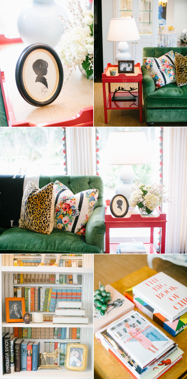
Living Room: Even though this is an older house, it had a nice big open living room, that was very strangely arranged with a half wall awkwardly dividing two separate seating areas. We removed the wall, and shifted the support to glass display cabinets flanking a wide entry that opened to the breakfast room and kitchen that we also reworked. This might be my favorite room I have ever designed. It is beautifully layered, bold, but not loud, pretty and yet still comfortable.

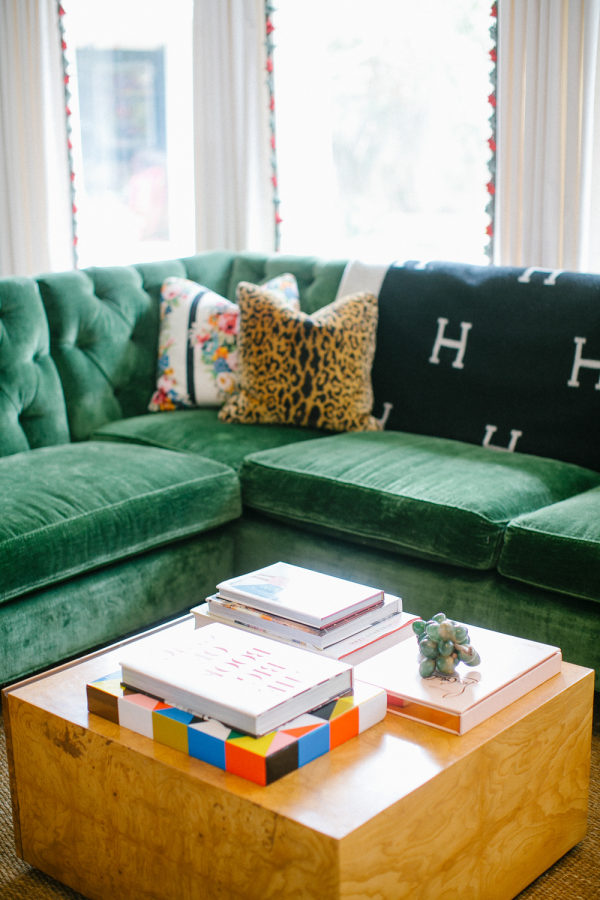
Everything started with the tufted sectional that we designed for the family based on a sofa I have in my own home that they loved. The rug is casual grasscloth, simple white curtain panels got blue and red Samuel & Sons tassel trim. The coffee table was a delightful find on 1st dibs, gorgeous burlwood with a giant drawer where their two year old sons impressive dinosaur collection lives. We redid the previously existing built ins, backing them in this famous library wallpaper, and added the brass light fixtures. A vintage chair the family had was reupholstered in light blue chintz, and finished everything off with lacquered red side tables and some sassy pillows.

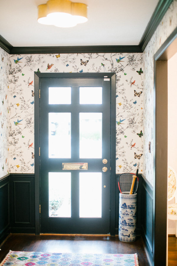
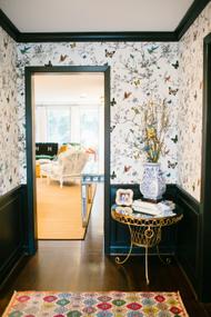
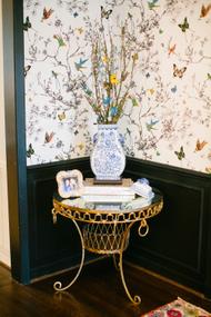
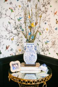
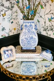
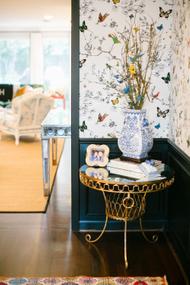
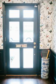
Entry: In many ways the plan for the whole house started with this incredible wallpaper in the entry hall. Natalie had lost her mom shortly before we started working together, and butterflies were a symbol that was really special to her and her relationship with her mom. We both loved the paper, and that it brought her mom into the home immediately. The color palette for the home overall was influenced by the colors in the paper- blues, greens, and pops of red were carried throughout.

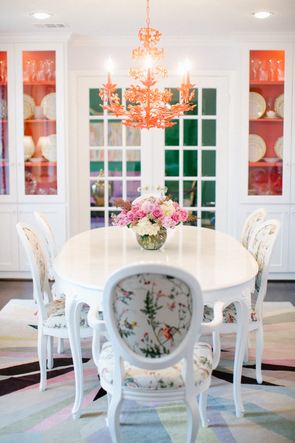
Dining Room: The dining room is immediately off the entry hall, and we wanted it to be a show piece since you see it first, and they had a breakfast room for everyday dining off the kitchen. The walls are a barely there lilac, offset by the bright red chandelier and china cabinets. The colors in the traditional Cole & Sons Hummingbird fabrics on the dining chairs are echoed in the geometric pattern on the rug. Art by Jenny Anderson of My Favorite and My Best pull everything together.


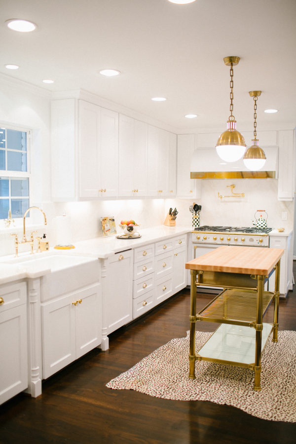
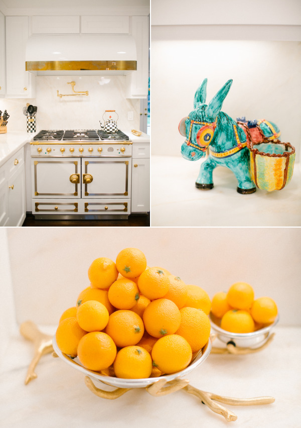
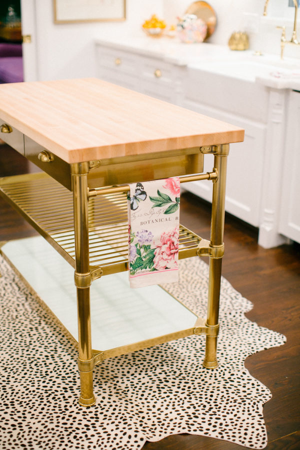
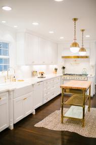
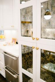
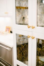
Kitchen: The kitchen before was straight scurry. So dark, and closed off from the rest of the house. I would say we brightened things up a bit. Normally the showpiece would be that amazing range, but there are so many delightful moments to be enjoyed here. I love the dash of Elvis in the mirrored pantry doors, the marble is stunning, and the island was a great find from Williams Sonoma.


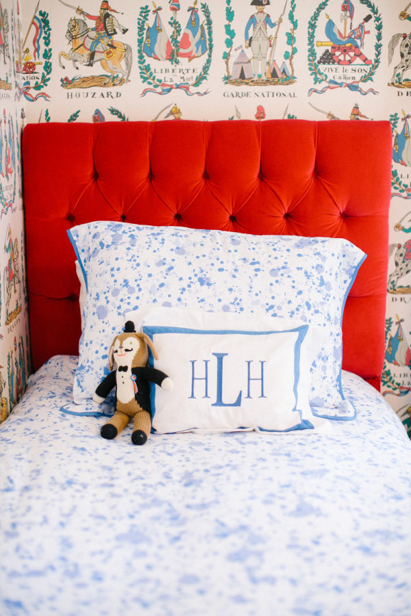
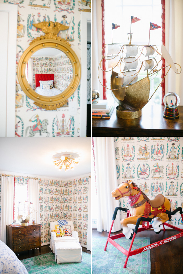
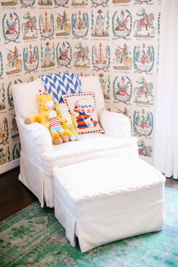
Houston’s Room: Natalie brought me an inspiration picture of a kids room with this wallpaper and we had to have it. I LOVE how everything came together. It is theme and cute enough to be a totally magical kids room, but all of the elements will easily transition to a more adult space later in life.

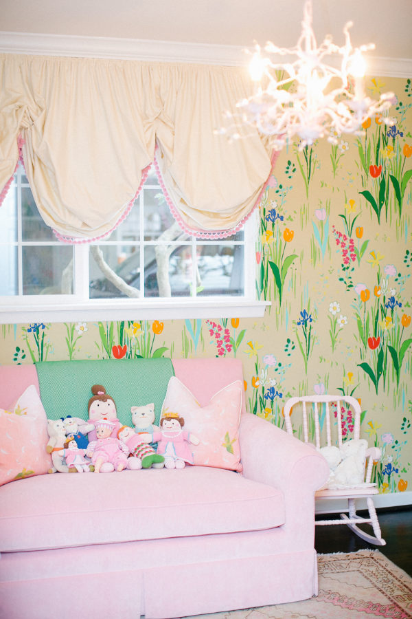
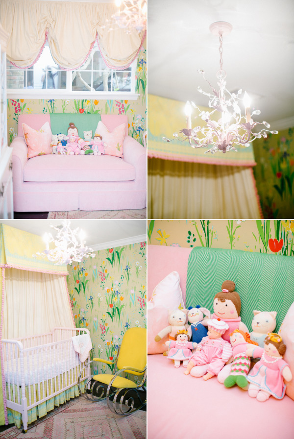
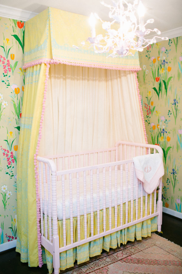
Harper’s Room: Ok, I know I said the living room is my favorite room I have ever done, but I think I lied. I think this is really my favorite. A precious little jewel box for their sweet baby girl. We started with this Paule Marrot for Brunschwig wallpaper that I have used before, but I really dig the beige background of this color way. It cuts the sweetness of everything else a bit.

It’s a tiny room, and a pretty bold paper, so we kept things simple and pink elsewhere. The loveseat pulls out into a guest bed if needed, and the vintage pink rug is a great grounding piece.

The jenny lind crib was painted the same pink as the light fixture, which all matches the sofa and pom trim. The canopy fabric is just so lovely, and I really favor the unexpected dose of cool from the vintage rocking chair.

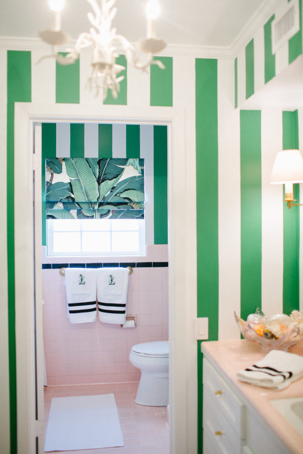
Hall Bath: I love the changes we made in here. This is the bathroom shared by both children, and we kept the original pink tile that was in really good shape. When we started there was seriously granny floral wallpaper and band of accent tile that made the pink tile look tragically dated. We removed the wallpaper and added the bold green stripes, and had the accent tile painted over with black, and it totally updates the look. I think it is a great compromise for a bathroom shared by a boy and a girl.


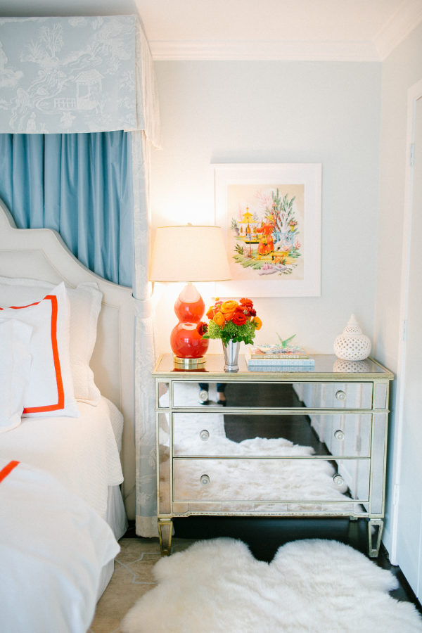
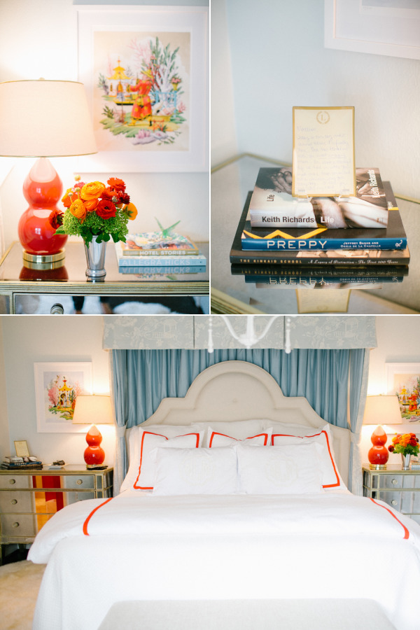
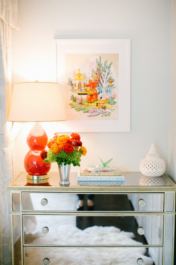
Master Bedroom: This space is a calming retreat for the busy parents. The walls are just the purest shade of blue, and the canopy is so stunning in person. We backed this lace chinoiserie fabric that is UNREAL in a soft blue so that you can really appreciate the detail. The rug is a soft taupe Madeline Weinrib that ties in with their existing headboard and monogrammed shams. We had to punch things up just a bit though, and the lamps, bedding, and art add just enough oomph.

| Share this gorgeous gallery on | |
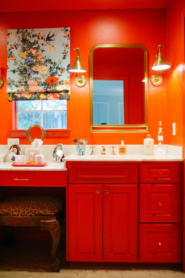
Master Bathroom: The bathroom before was a tired beige builder grade bummer. Eventually it will need to be totally redone and expanded, but for now they wanted to live with it and address the problem in a renovation down the road. I have to give the owners so much credit for not telling me I was straight up cray when I suggested we just paint the whole thing FLAMING RED. There were totally up for it, and I even shocked myself with how well it worked. You definitely don’t notice the aging beige tile anymore! We replaced the countertop with leftover marble from the kitchen slab, and switched out the mirrors and lighting with these brass stunners. The christian lacroix moment on window treatment is pretty snazzy too.
SOURCES
HALL BATH
Paint Color: Benjamin Moore Bunker Hill | Curtain Fabric: Designer Wallcoverings, The Original Martinique 90210 – Beverly Hills Fabric | Sconces: Circa Lighting (Ginger Single Arm Sconce) | Ceiling fixture: Ballard Designs, Coral 3 Light Chandelier
DINING ROOM
Wall Color: Benjamin Moore Nosegay | Light fixture: Contact Biscuit Home | Chair Fabric: Cole & Son, Hummingbirds | Rug: The Rug Company, Zap rug | Painting: Jenny Andrews
ENTRY HALL
Wallpaper: F Schumacher (Birds and Butterflies) | Rug- Vintage via ABC Home
LIVING ROOM
Sectional: Custom Biscuit Home | Sectional Fabric: Lee Jofa (Bragance II) | Floral Pillow- Ralph Lauren (Ladie’s Day Floral, Spectator) | Leopard Pillow: Scalamandre (Leopardo) | Blanket: Hermes Avalon Blanket | Coffee Table: Vintage, 1st Dibs | Side Tables: Oomph, Edgartown Side Table | Lamps: Robert Abbey Double Gourd via Biscuit Home | Wallpaper on Bookshelves: Brunschwig & Fils, Bibliotheque Multicolor | Sconces above bookshelves: Circa Lighting, Dean Picture Light | Wall Color: BM Polar Ice | Curtain Trim: Samuel & Sons (Chambord Tri-tassel fringe) | Blue Floral Chair: Vintage Recovered | Blue Floral Chair Fabric: Lee Jofa, Grenville Glazed Chintz Blue
HARPER’S ROOM (GIRL)
Sofa: Custom via Biscuit Home | Rug: Vintage | Pom Fringe: Samuel & Sons (Dolce Pom Pom Fringe) | Wallpaper: Brunschwig & Fils (Guermantes) | LightFixture: Vintage | Green Throw: Biscuit Home | Rocking Chair: Vintage 1st Dibs | Pink Crib: jenny lind | Pink Paint Color: BM Peppermint Pink | Crib Sheet: Biscuit Home, Jamie Multi
HOUSTON’S ROOM (BOY)
Wallpaper: Brunschwig & Fils (Battle of Valmy 1792) | Light Fixture: Jonathan Adler via Biscuit Home (Jonathan Adler Sputnik) | Chest: Well Appointed House (Burl Wood Chest) | Trim: Samuel & Sons | Rug: Lulu & Georgia | Headboard: Custom via Biscuit Home | Bedding: Biscuit Home — Jamie Blue duvet, Jamie Blue Sham, Cornflower Blue Sham | Throw Blanket: Biscuit Home | Lamp: Vintage
KITCHEN
Stove: William Sonoma | Island: William Sonoma | Lights: Circa Lighting (Hicks Pendant)
MASTER BEDROOM
Side Tables: Z Gallery | Lamps: Lulu & Georgia | Art: Harrison Howard Fine Art here and here | Light Fixture: Ballard Designs | Bench: Restoration Hardware | Duvet: Biscuit Home | Euro Shams: Biscuit Home | Canopy: Brunschwig & Fils (Manchuria Madras) Kravet (KF-BAS-DRP-SIL) | Rug: Madeline Weinrib
MASTER BATH
Paint Color: BM Ruby Red | Lights: Circa Lighting | Mirrors: Restoration Hardware | Curtain Fabric: Osborne & Little, Designers Guild, FCL004/01
Photography: Kimberly Chau Photography | Cakes: Jonathan Adler | Beauty: Restoration Hardware | Beauty: Ballard Designs | Decor: Z Gallerie | Vendor: William Sonoma | Vendor: Biscuit Home Goods | Vendor: Circa Lighting | Vendor: Schumacher | Vendor: Lulu & Georgia | Vendor: The Rug Company | Vendor: Samuel & Sons | Vendor: Lee Jofa
Join The Conversation
favorite (0) share share (0) pin (0)
