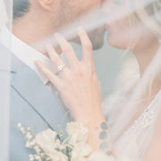
“For the last 5 years, this sweet bride has dreamed of having her wedding featured on her all-time favorite wedding blog, Style Me Pretty.” Ahhhh! I LOVE that! You know, it’s so easy for us to sit behind our computers and get lost in a sea of pretty, forgetting that the weddings we are sharing are stirring up that excitement that couples so often need when they are in the thick of planning their own big day. Hearing little nuggets like this bring SUCH joy to our hearts and seeing a wedding inspired by her years of reading our little blog…beyond. With photography by Charissa Magno and exquisite planning by Kelsey Rae Designs, this is one of those weddings that will fill your heart with big crazy love.
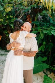
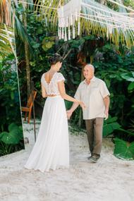
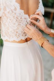
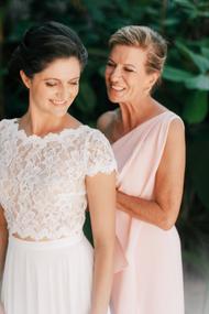
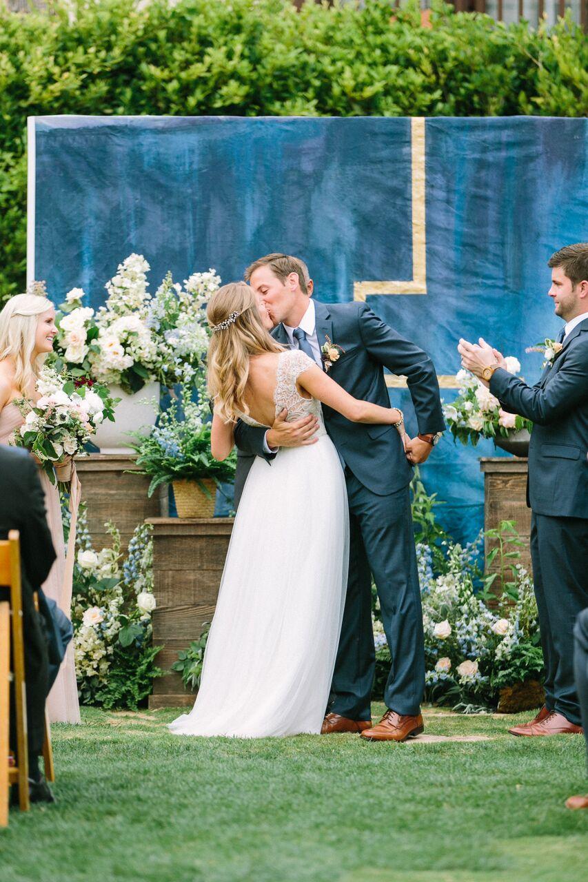
From the bride…There are so many moments throughout our wedding day that stick out in my mind. Of course, there are the moments that you look forward to and think about your whole life. Getting into my gown with my mom and my aunt, my dad seeing me for the first time in my dress, mine and Andrew’s first look, walking down the aisle with my dad, exchanging vows, our first dance – these are all moments that I will never forget.
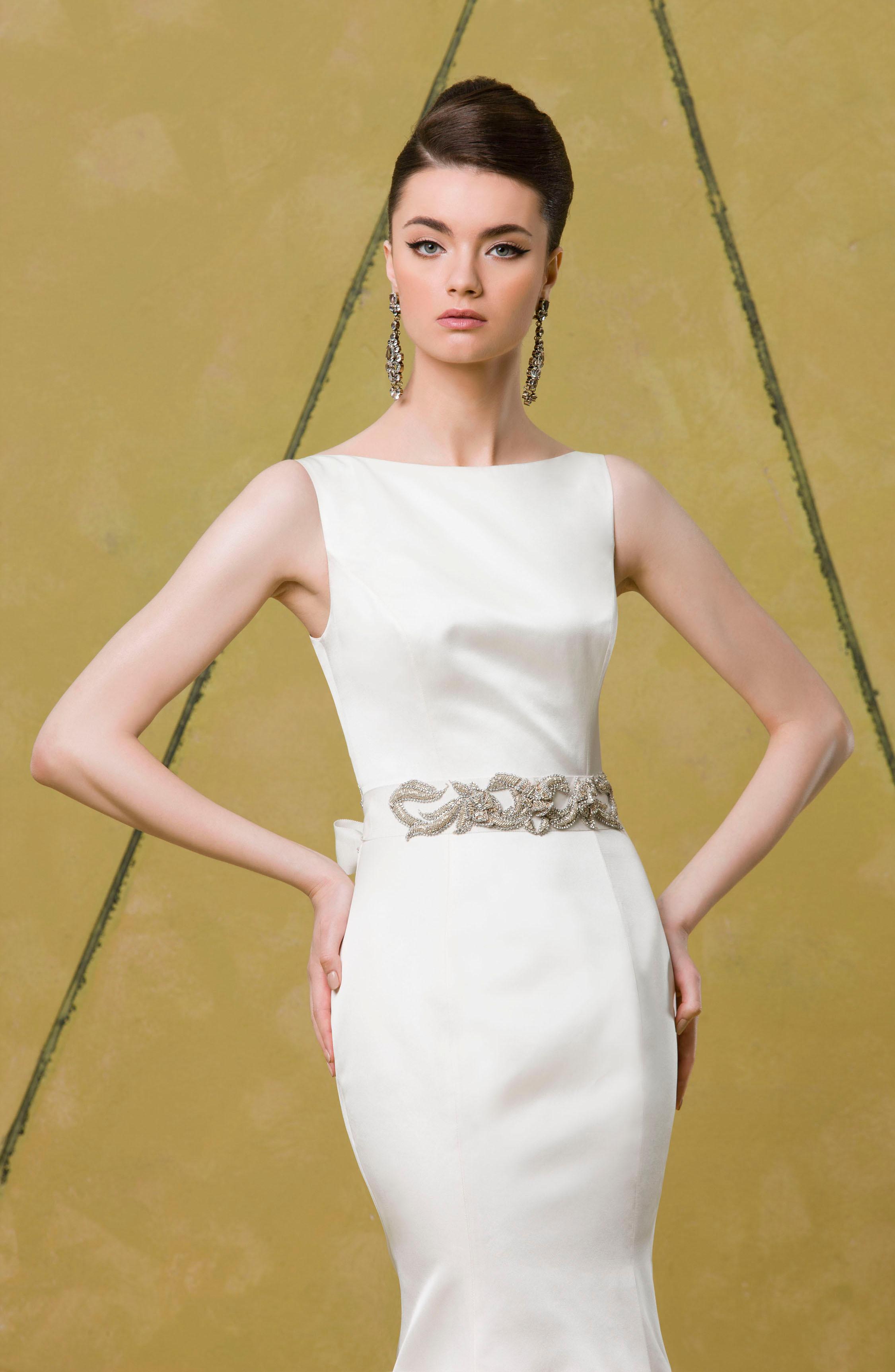
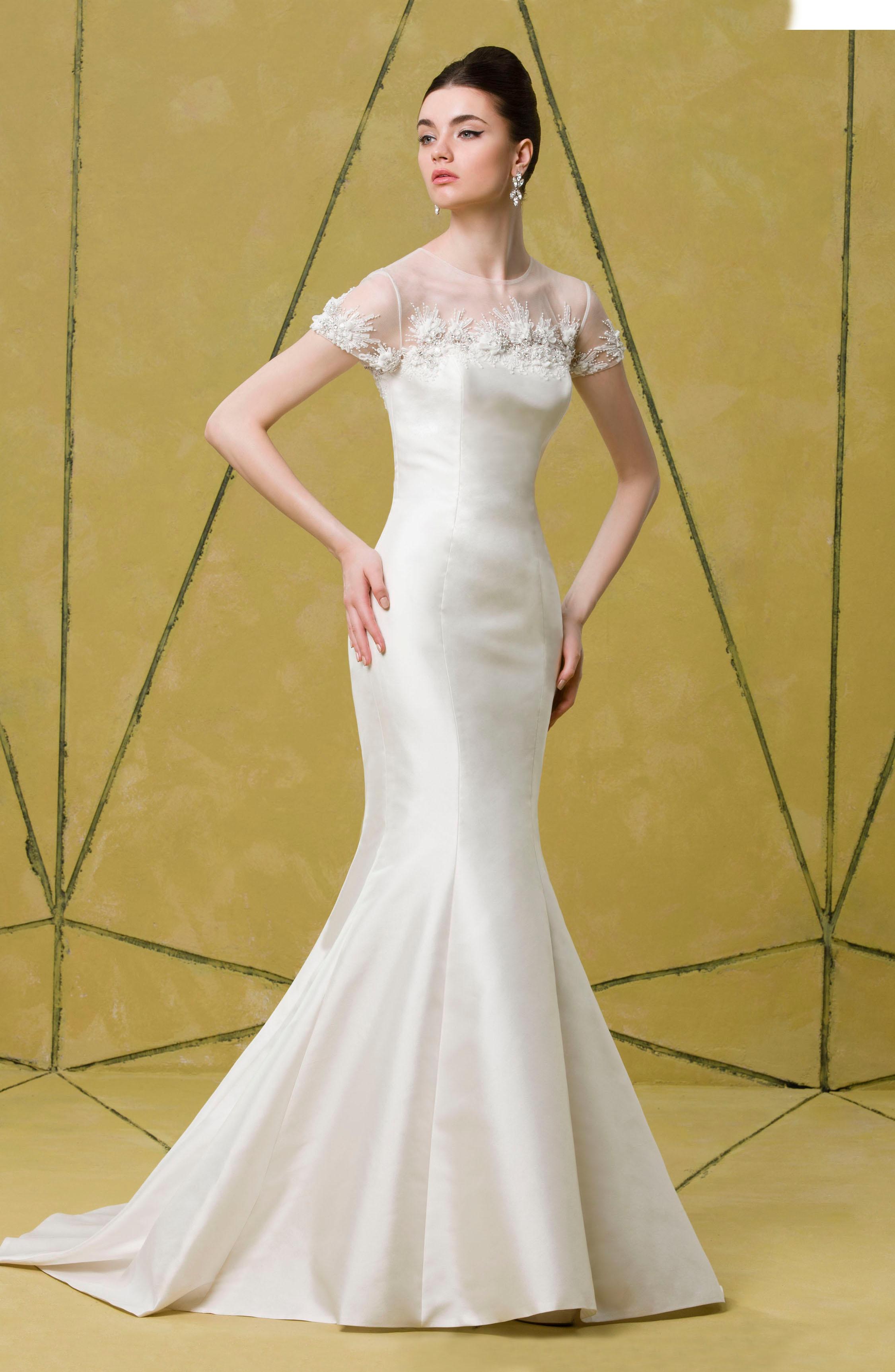
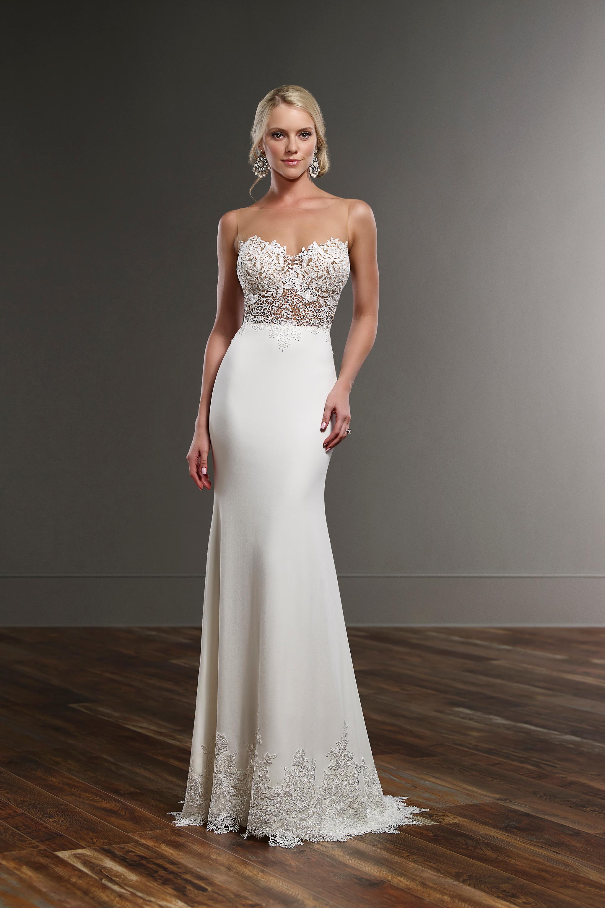
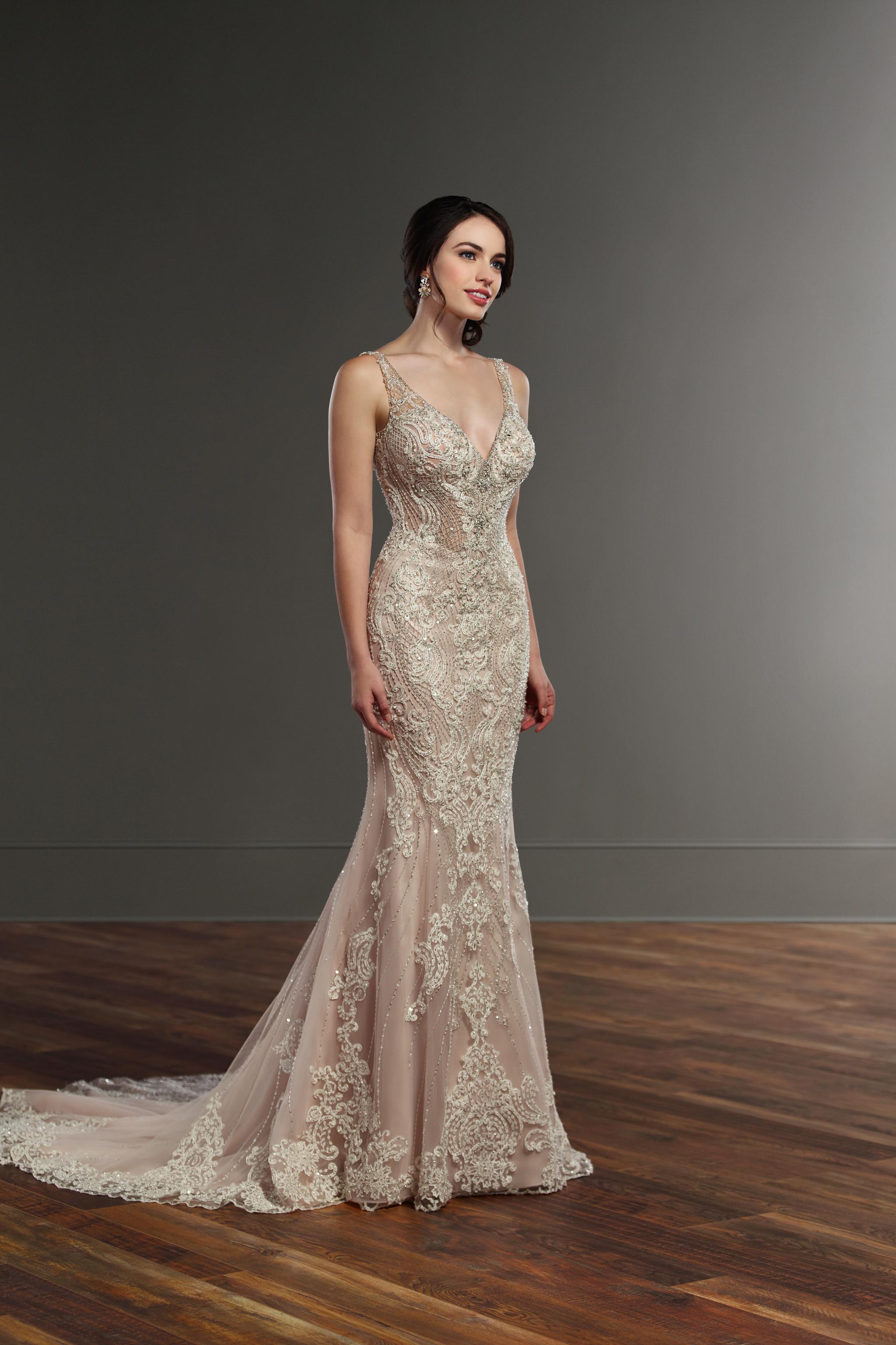
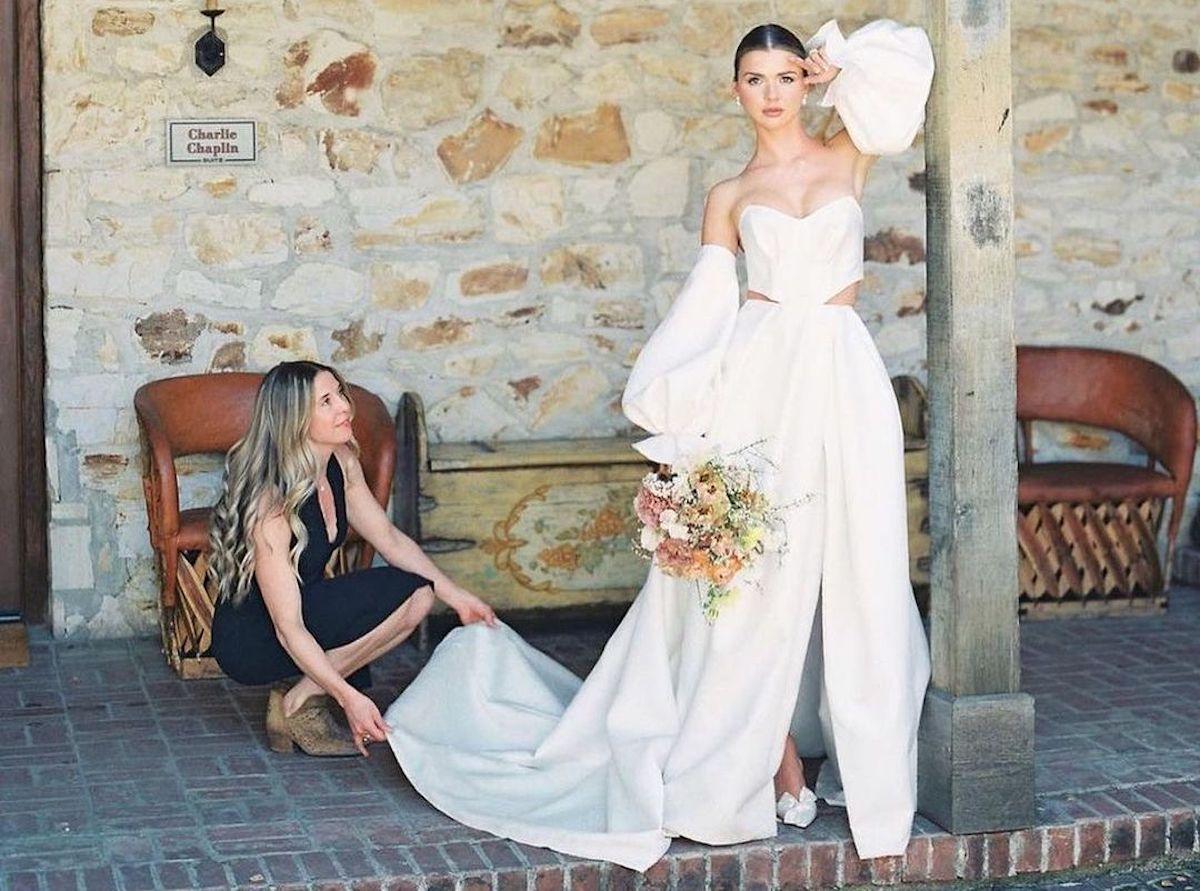
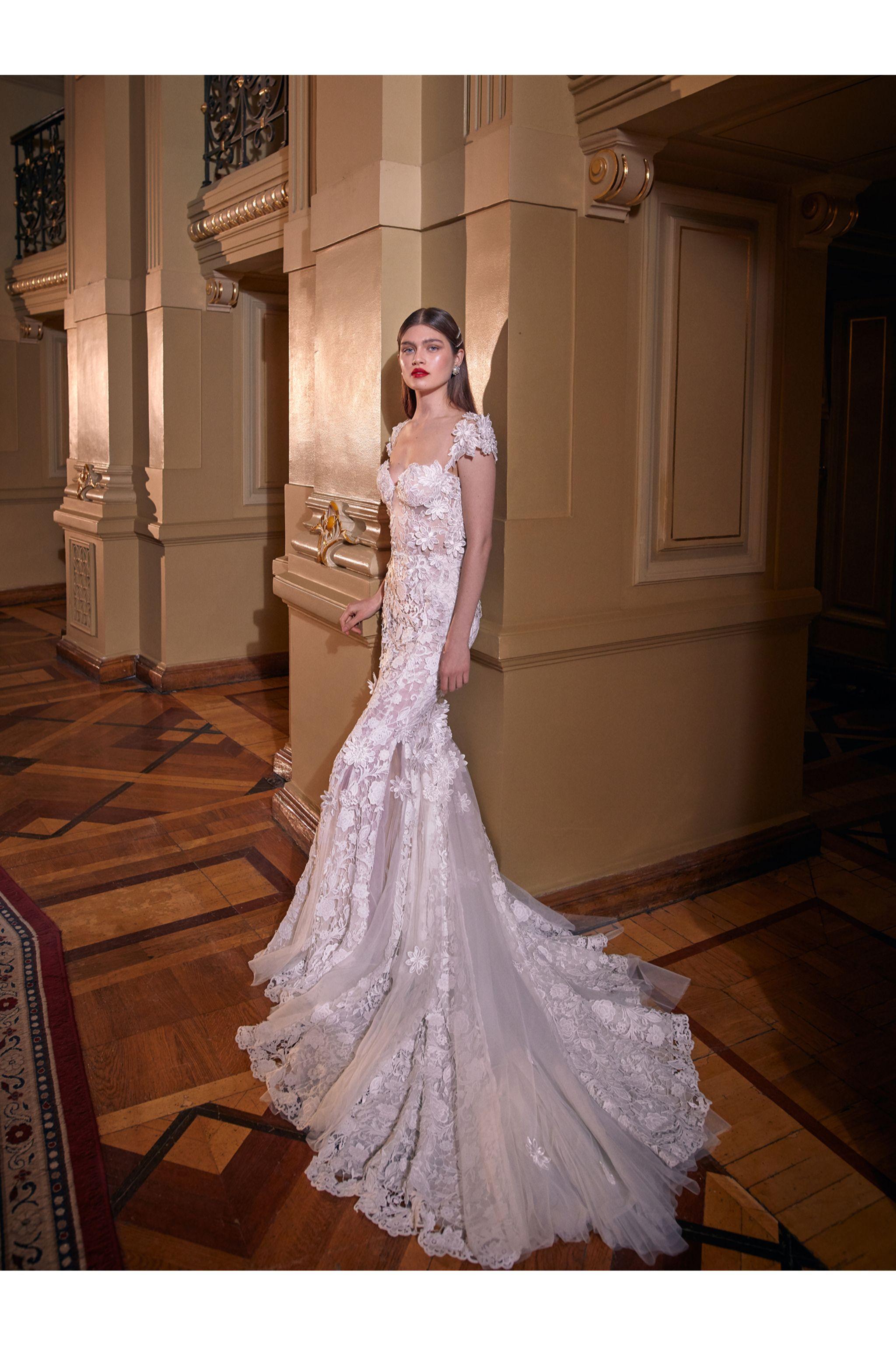
THE GOWN. I chose the Chandon gown by Hayley Paige for my wedding gown. It was the perfect mix of a WOW factor without being overdone! The original gown comes with sparkle embedded into the tulle but I opted out of the added glitz. To me, the beauty of the dress was in the dimension and texture of the fabric – it totally spoke for itself.
For an added element of personalization, I had my seamstress sew a small piece of fabric from the dress I was wearing the first time Andrew and I met. I’ve saved it all these years knowing that I wanted to put it to good use and this was the perfect opportunity. No one knew it was in my dress besides me and Andrew was so touched when I showed him at the end of the night.
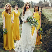
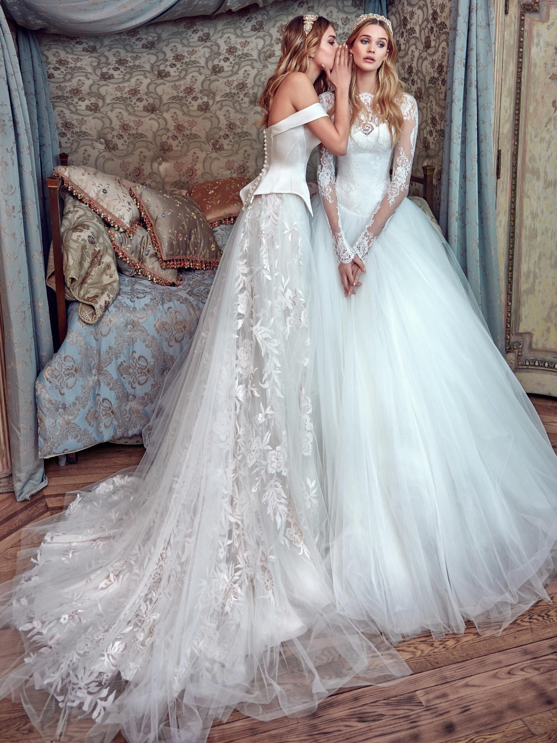
BRIDESMAIDS STYLE. For my bridesmaids, I knew from the start I wanted them to be in floral crowns. It was a fun, whimsical touch but I didn’t want the crowns to be competing with bulky bouquets. To avoid this, I completely abandoned their bouquets altogether and gave them floral crowns only. Having been a bridesmaid before, I know how heavy those bouquets can be so I’m sure the girls appreciated it! Plus, they got to wear their crowns the entire night instead of leaving their bouquets on the table as soon as the dance floor opened.
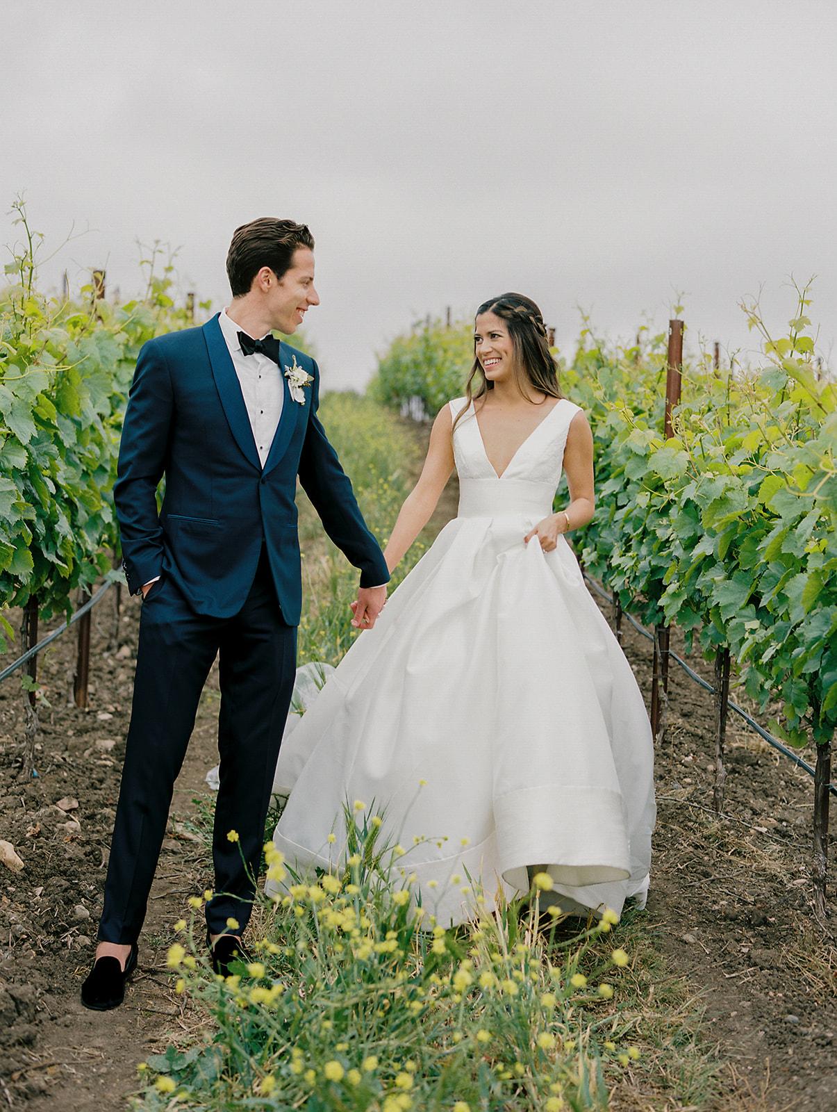
GROOM STYLE. For Andrew, we knew we wanted him to look different from the groomsmen while still maintaining a cohesive, classic vibe. We decided on a velvet bow tie and velvet dress shoes for Andrew, which was the perfect expression of his fun style! For the groomsmen, we kept it really classic with a satin bow tie and leather dress shoes. To ensure all of the colors were definitely the same (blacks can clash sometimes!), we stuck with The Black Tux for all of the men’s rentals.
COLOR PALETTE. For color palette, we stuck to all the soft neutrals with touches of lush greenery wherever possible. My vision was a formal wedding with little bits of organic nature-inspired bits sprinkled throughout. Ivory, gold, and green made the base color scheme. Everything soft – all of the fabrics, napkins, bridesmaids dresses, upholstered chairs – was a neutral shade of ivory or beige. This gave the entire wedding a really ethereal feel.
Any of the green elements came from nature – floral arrangements, accents on the signage, boxwood hedges. This added in the organic component that tied in with the venue’s gardens. Most of the gold elements came from small décor elements – personalized wooden place cards, candle sticks, mercury glass votives, laser cut signage and quotes, and flatware. These little things made a huge impact in terms of glamour. The gold pieces added just the right amount of sparkle the day needed.
FAVORITE DETAIL. My favorite detail of the entire day was the laser cut quote The Confetti Home made us to go on the hedges behind the head table. I went back and forth with the shop owner, Lindsay, about what size to make it because I wanted it to be substantial while still being able to fit in photographs. The quote said “I’d choose you in a hundred lifetimes, in a hundred worlds, in any version of reality, I’d find you and choose you.” We originally intended on this quote being used as a reading in the ceremony but I loved it so much that I wanted it to be a focal point of the entire wedding. It turned out better than I could have imagined and really set the tone for the whole reception’s décor.
THE DONUT BAR (!) Another fun thing we did was a twist on a donut bar! I have been obsessed with donuts for as long as I can remember so I knew we had to incorporate them into the big day but didn’t want a predictable donut wall or donut buffet, which have gotten so popular in the last few years. Instead, we hired Sensational Treats to fry up fresh mini-donuts on site as a late night snack! It was fun for the guests to watch and there is quite literally nothing on Earth better than hot, fresh donuts. We also ordered custom bags from HH Paper Co that said “Holy Matrimony” with a donut as the “O.” It was a super fun touch!
THE ENTERTAINMENT. One of the most unique details we included was a live artist who did custom watercolor portraits of all of the guests. I searched high and low for an artist to do a live painting of the ceremony but ultimately landed on Dianuh from Chasing Linen because I was obsessed with her style and loved the fact that the guests could take home their portraits as a keepsake! The guests absolutely loved this detail and all mentioned how they’d never seen anything like it before.
THE MOMENTS. My favorite moment of the entire night was something totally unexpected. Since I had planned the wedding for 11 months, I basically knew what every minute of the day was going to look like, or so I thought. Andrew gave a quick thank you speech at the beginning of the reception but he added a little something that was so fun. Quick back story, I never played any sports and was certainly never athletic enough to win a trophy for anything. Andrew said “I hope this doesn’t embarrass Lauren but she’s never gotten a trophy for anything before….” I started looking around and literally almost fainted from excitement. Our DJ comes around the corner with a trophy that Andrew had made for me, engraved with “Best Bride and Planner of the Best Wedding Ever.” It felt like I won an Oscar!
[iframe http://player.vimeo.com/video/273247735 600 338]
Share this gorgeous gallery on | |
INSPIRATION FOR YOUR DESIGN. The venue we chose was a huge inspiration for our wedding style. The beautiful gardens and manicured lawns were practically begging for this look. The Inn at Rancho Santa Fe is lavish but not flashy, organic but not too rustic, and high end but not stuffy. The perfect description of our style as a couple. As soon as I laid eyes on the property, ideas for our design started flying into my head but I couldn’t quite peg the style in my head because it was something I’d never seen before. I started our design with ivory florals, soft greenery, and touches of gold and the design expanded from there.
TELL US EVERYTHING ELSE!
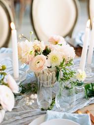
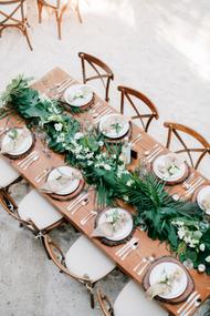
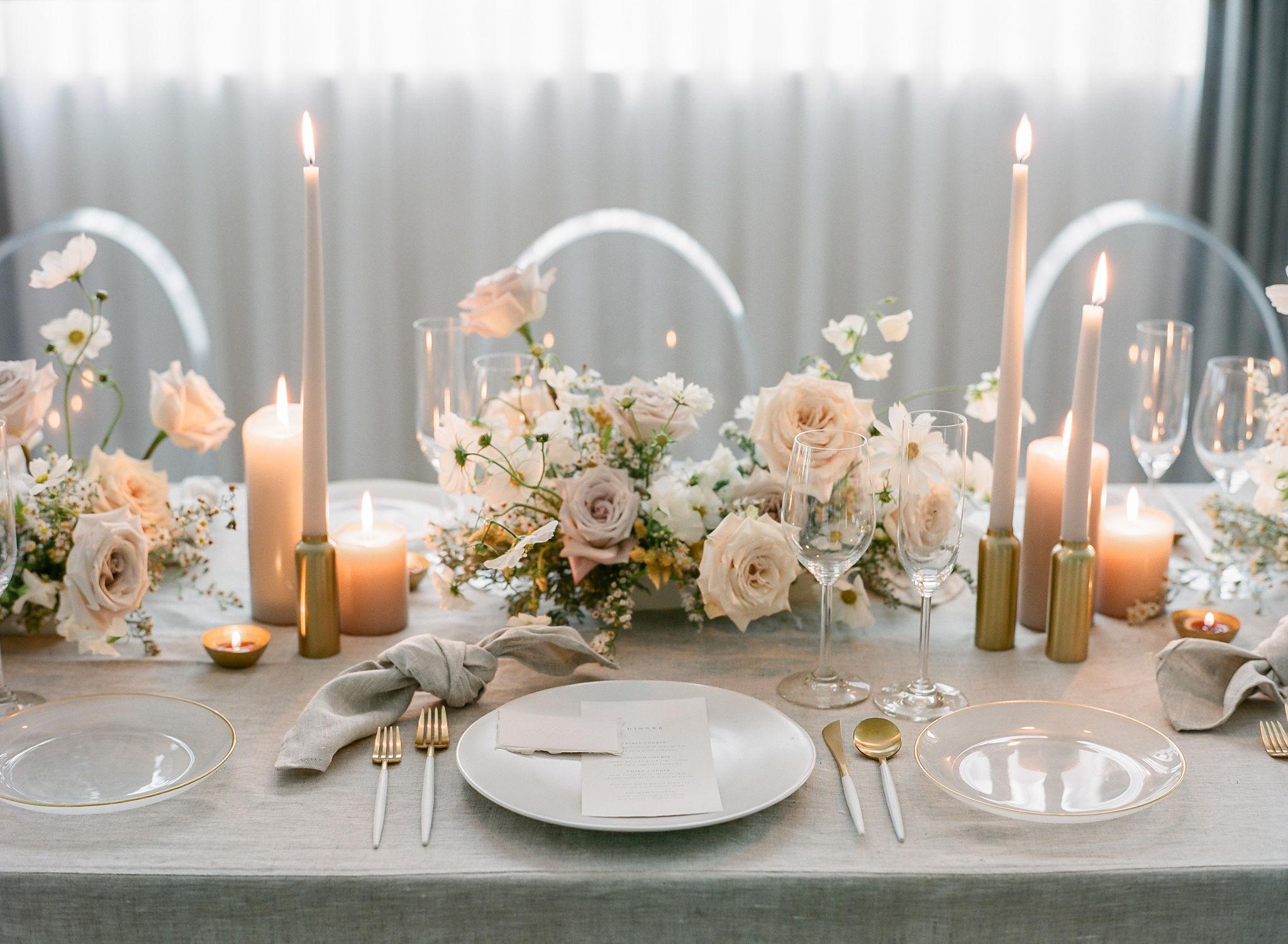
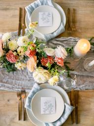
Flowers…The florals quickly became the focal point of the entire wedding. Especially because the venue itself has such a garden feel, it only felt right to have the entire property dripping in luxurious flowers and greenery. I worked with my florist, Diamant, to create the most stunning floral design for our big day. We opted out of having any linens (besides napkins) on the table and replacing them completely with lush garlands, made completely of florals and greens. For the meal indicators, we used different types of greenery: silver dollar eucalyptus, olive leaf, and rosemary were placed under the glass, gold-trimmed chargers. This choice was both practical and pretty!
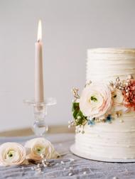
Cake…For our cake, I really loved the idea of semi-naked but wanted to glam it up slightly. We worked with Laura Marie to create the perfect balance of organic and glamour! We did a three-tier cake with vanilla buttercream just barely covering the outer layers. To add glitz, Laura added a few sheets of gold foil to the center of the cake. She also added some of our florals to the top and bottom tier to make the cake fit in with the rest of the décor. Also, she made the most gorgeous gold foil donuts I have ever seen. Almost too pretty to eat!
Signage…For laser cut signage, we had multiple words and quotes made by The Confetti Home. This kept the all of the reception décor consistent – we used the same font, size, and color for all of the cutouts. They were placed throughout the reception – behind the bar, as a backdrop for the head table, on the donut bar, and at the artist’s station. For the rest of the signage, I opted for a much more modern look. The main reason for this is because I didn’t want the signs to distract from any of the other décor. Also, I knew I didn’t want anything wooden because that was more rustic than I wanted. I went with acrylic signs by Details, Darling and they were perfect! She made all of the acrylic pieces – the seating chart, table numbers, welcome sign, unplugged ceremony sign, and candle ceremony quote. I worked with the shop owner, Mackenzie, to personalize the fonts so that they coordinated with the calligraphy style used on the other laser cut signs.
Ring Bearer & Flower Girl Style…To continue the acrylic theme into other areas besides the signs, I found acrylic square boxes for our ring bearers to carry the rings in. To keep them from looking too modern, my florist filled them with olive leaves to place the rings on top of. For the flower girl, I didn’t want a cheap fabric basket and it was impossible to find a cute option! I ended up finding a gorgeous gold basket and had my florist add some pretty greenery around the handle to tie it in with the wedding’s style.
Ceremony Details…During the ceremony, we did a candle lighting ceremony to recognize all of our family members that have passed away. I framed their photos, all in black and white, in gold frames and had them set up next to an acrylic sign saying “We know you would be here today if heaven was not so far away.” It was such a special way of honoring our loved ones that I am so glad we incorporated.
Seating Chart…Although the wedding was ultra formal, we wanted to be sure to add in a few fun touches to show our humor and personality as a couple. On the seating chart, instead of writing something super traditional, we had “seat yo’ self” written in gorgeous calligraphy. Very elegant while still being fun!
Fun Details…One of the biggest details that made a huge impact was the King Louis Chairs. This was one of the first things I rented because I knew it was going to make a big difference in the design. To save money, I used the same chairs at the ceremony and reception and had the company come and move them from one site to another while the guests were at cocktail hour. I know for a fact the wedding wouldn’t have looked as upscale without these chairs.
Best Advice for Couples-To-Be…One thing I want to tell brides-to-be is to enjoy every single minute. I know wedding planning can get stressful but try not to let it! Keep reminding yourself that you only get to do this one time. It’s not just the actual wedding day that flies by, it’s the entire planning process. Enjoy this time with your fiancé because you don’t get to be engaged for very long!
If you’re not the kind of bride that loves planning and getting into every little detail, invest in a wedding coordinator. It will make your planning process so much more fun! Even if you are the kind of bride that loves planning and getting into every little detail, invest in a day-of or month-of coordinator. It’s a life saver! Do whatever you can to make the process more fun for you! If that means getting family involved, do it! If that means having a longer engagement, do it! If that means having a tiny wedding, do it! Whatever makes you the happiest bride, do that!
Photographer: Charissa Magno Photography | Videographer: Audrey Alba Films | Event Planning: Kelsey Rae Designs | Floral Design: Blue Ladder Botany | Wedding Dress: JLM Couture | Bridesmaids' Dresses: Show Me Your Mumu | Make Up: Makeup By Kandice | Hair: Maria Peters A Style Concierge | DJ: Pacific Entertainment | Officiant: Vows From The Heart | Wedding Venue: The Inn at Rancho Santa Fe | Acoustic Guitarist: Austin Ellis | Acrylic Signage & Table Numbers: Details Darling | Bridal Shop & Alterations: The White Flower Bridal Boutique | Bride's Heels: Betsey Johnson | Cake & Donuts: Laure Marie's Cakes | Donuts: Sensational Treats | Groom & Groomsmen Attire: The Black Tux | Groom's Shoes: Aldo | Laser Cut Signage: The Confetti Home | Live Watercolor Painting: Chasing Linen | Place Cards: Better Wedding Decor | Rentals: APR Event Rentals | Rentals: The Chiavari Guys | Rentals: Classic Party Rentals | Wedding Ring: Leon Mege
Join The Conversation
favorite (0) share share (0) pin (0)